YEAR
2020
ROLE
UX Designer
CLIENT
BGRS
ABOUT CLIENT
BGRS offers software and services that help facilitate employee relocations globally.
PROBLEM
PROBLEM
PROBLEM
Relocation as a working professional can be a tedious and overwhelming process. Key tasks weren't being completed and we were losing users. With so many moving parts before and after a move, our clients, employees and our consultants needed an intuitive and centralized solution.
The relocation of working professionals is a tedious and scattered process. We were losing users and important items weren't being complete. With so many moving parts and things to do before and after a move our client’s employees and our consultants needed an intuitive and centralized one stop shop solution.
Navigation
Navigation
Navigation
Navigation
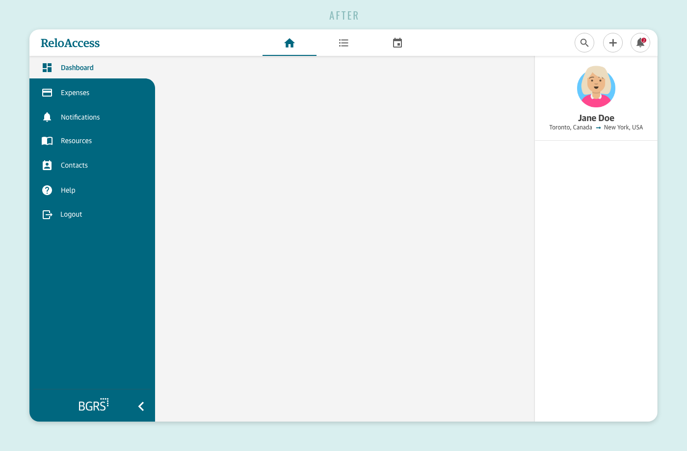
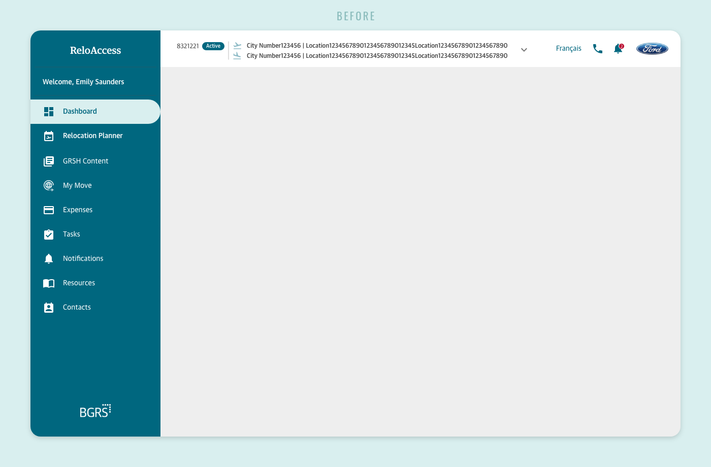
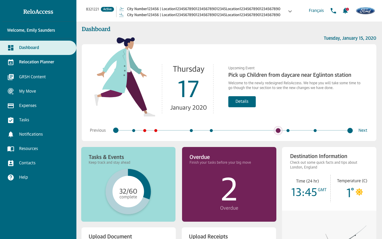
Part of a successful website is a great navigation structure. We interviewed several past transferees and determined the most and least used components.
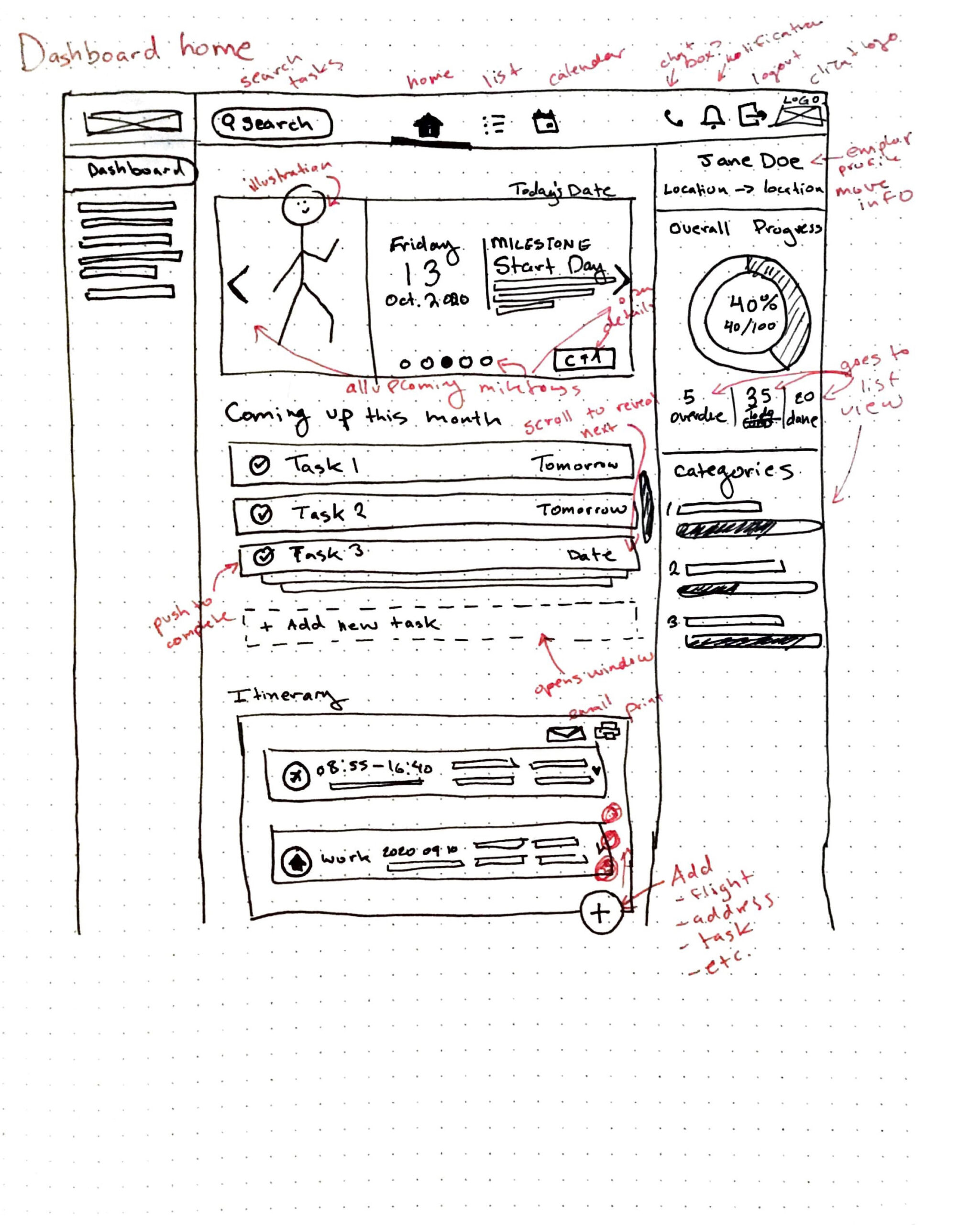
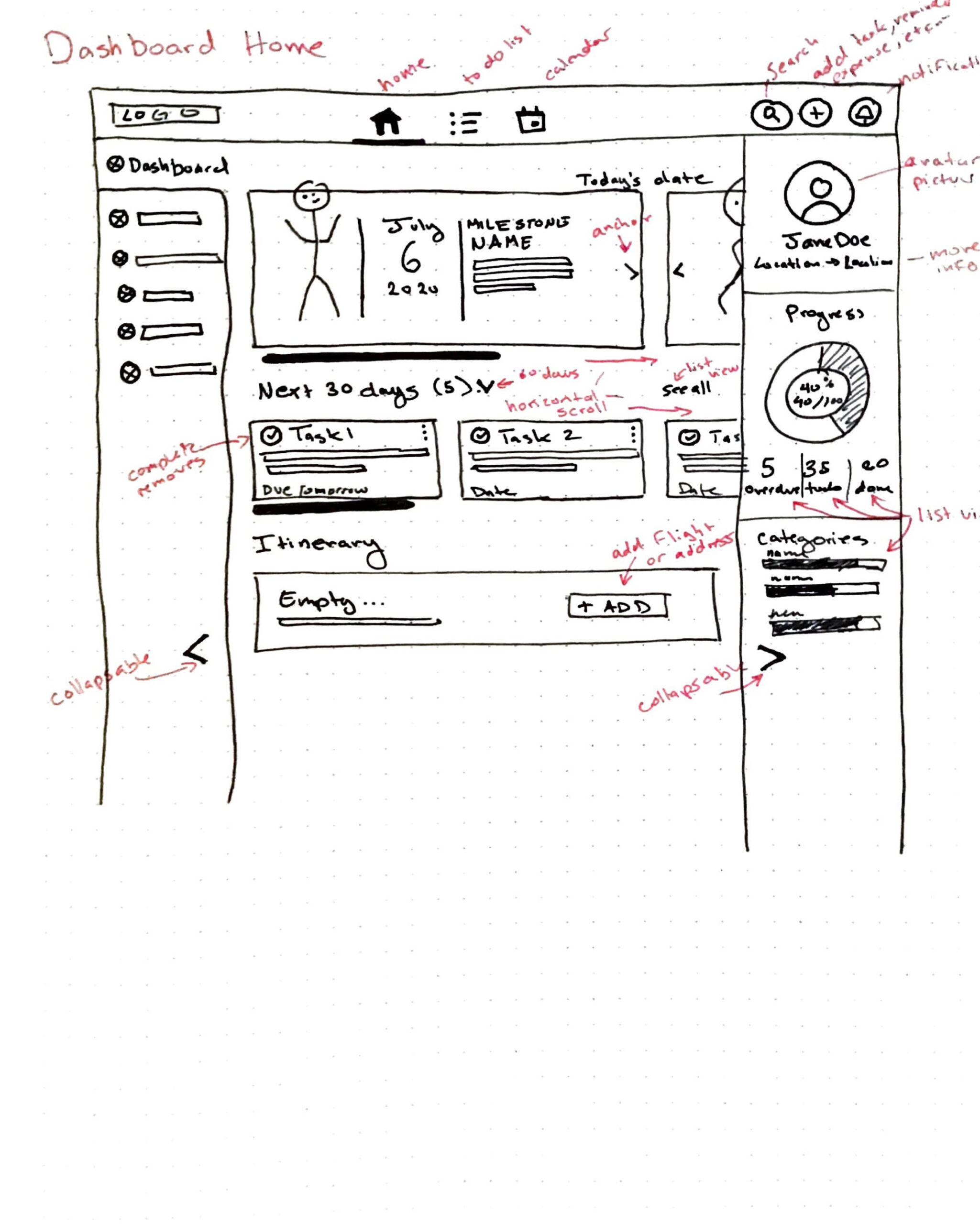
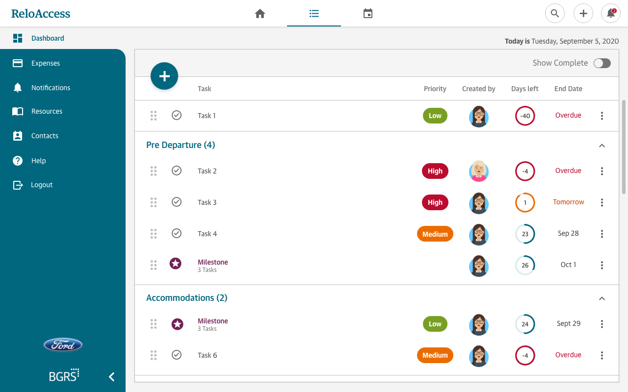
With a new home, list and calendar view and updated UI, we added an additional top navigation to the existing side navigation. Through task driven testing the response was that it was clean, intuitive, and easy to use.
Home View
Home Dashboard
Home Dashboard
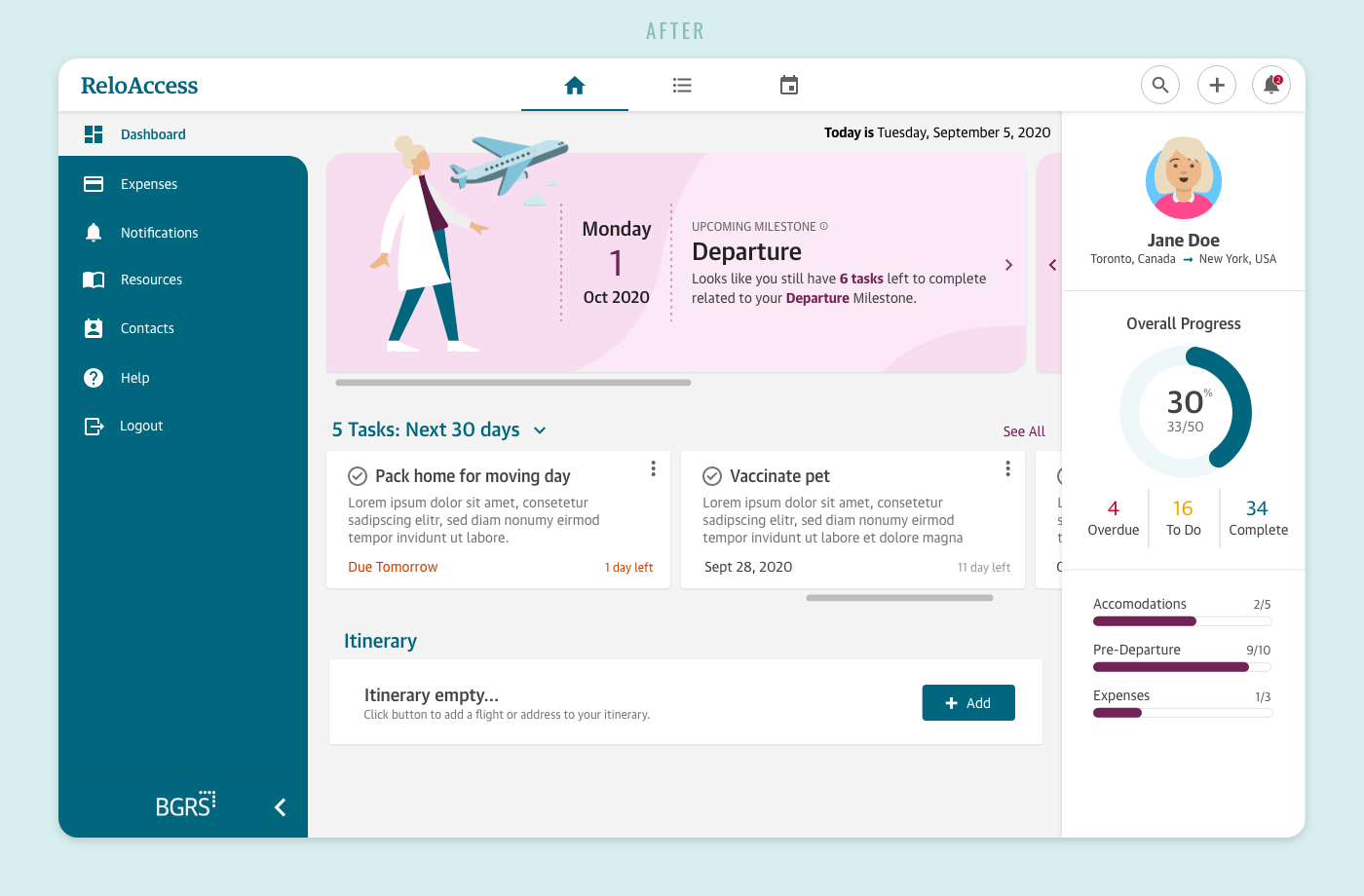
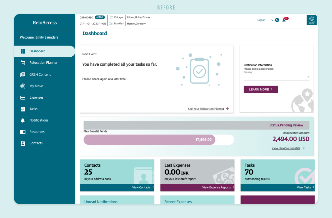
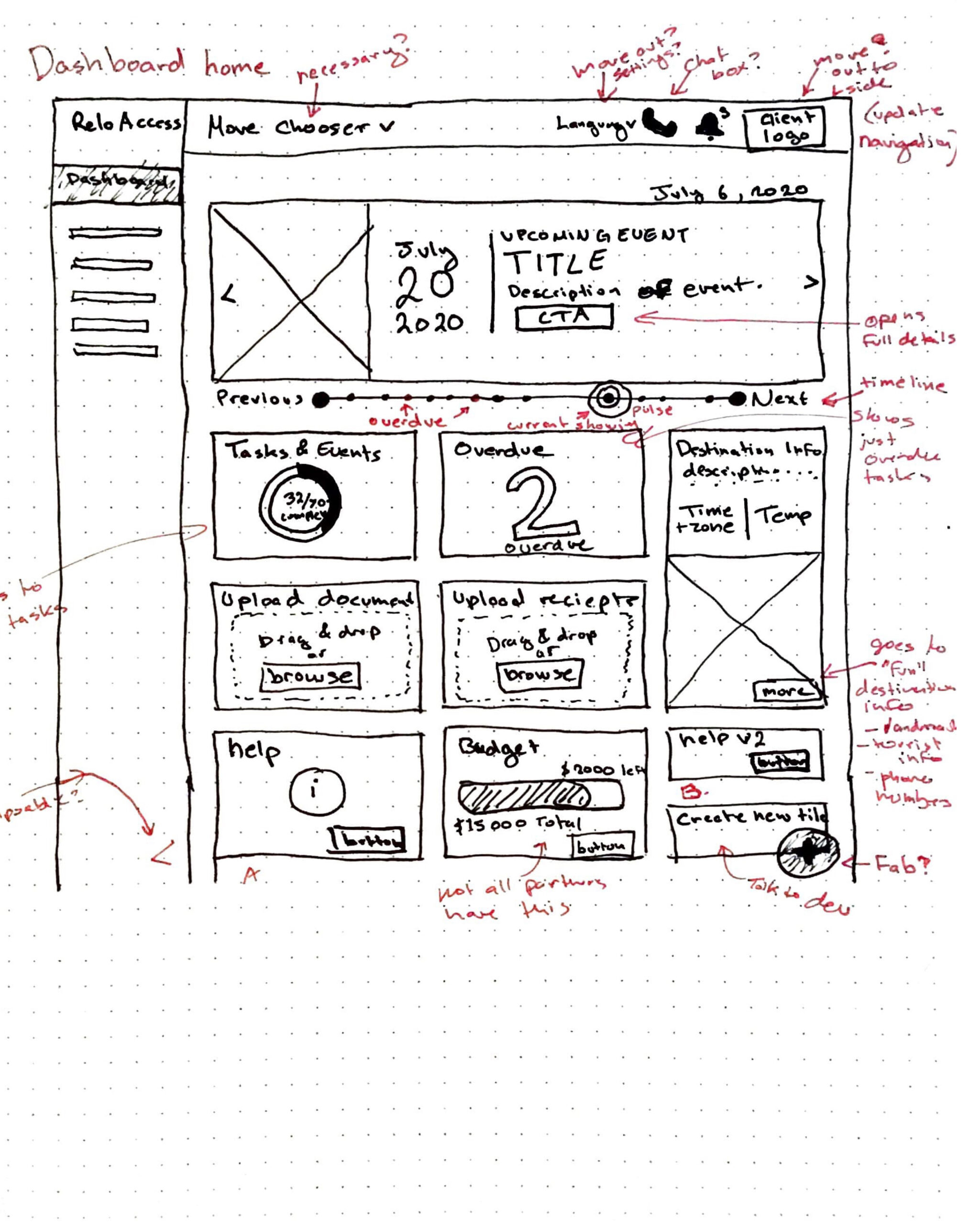
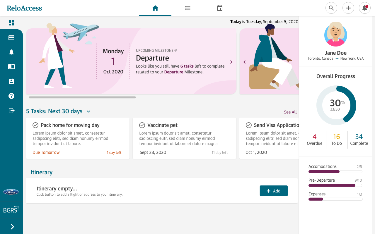
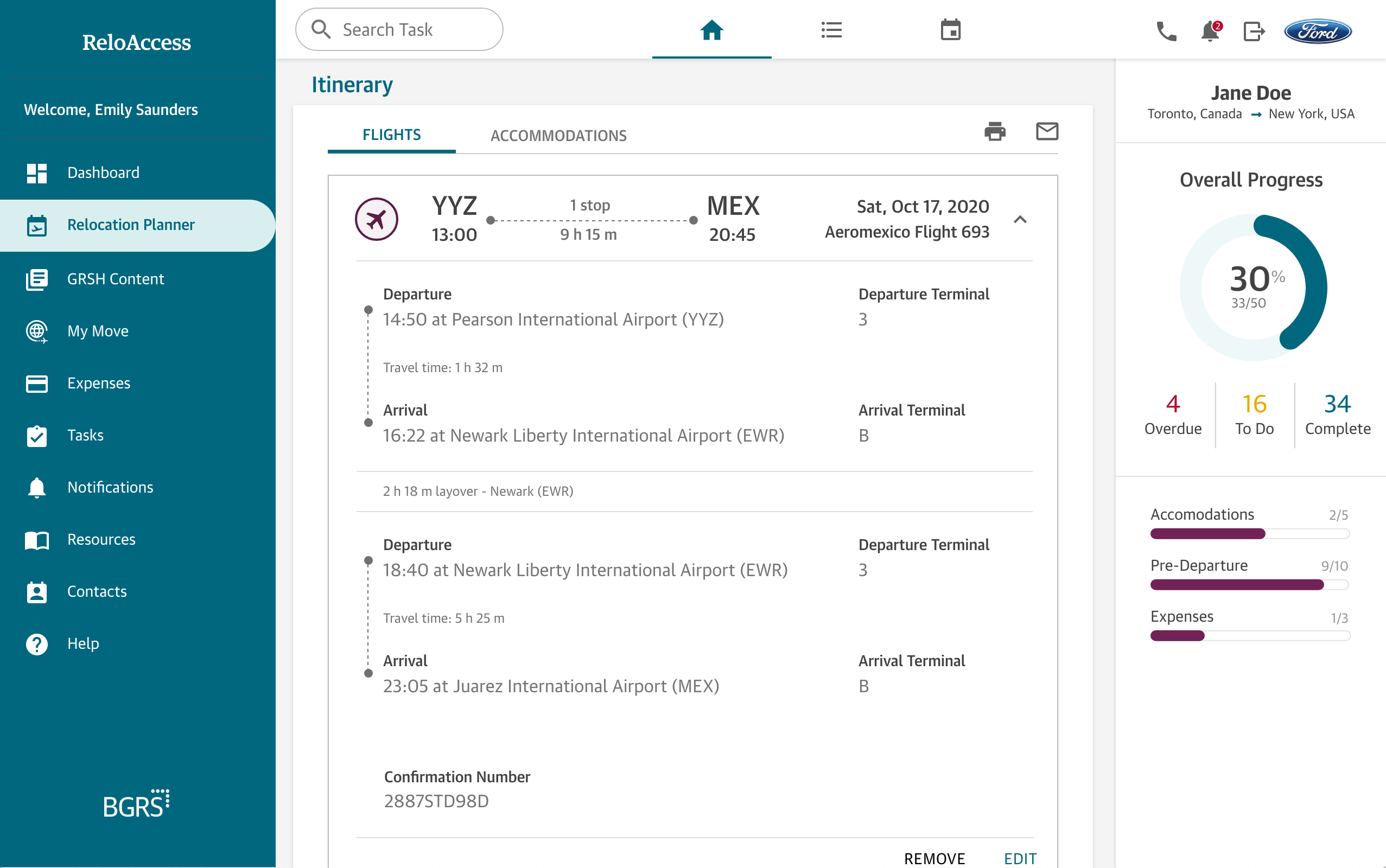
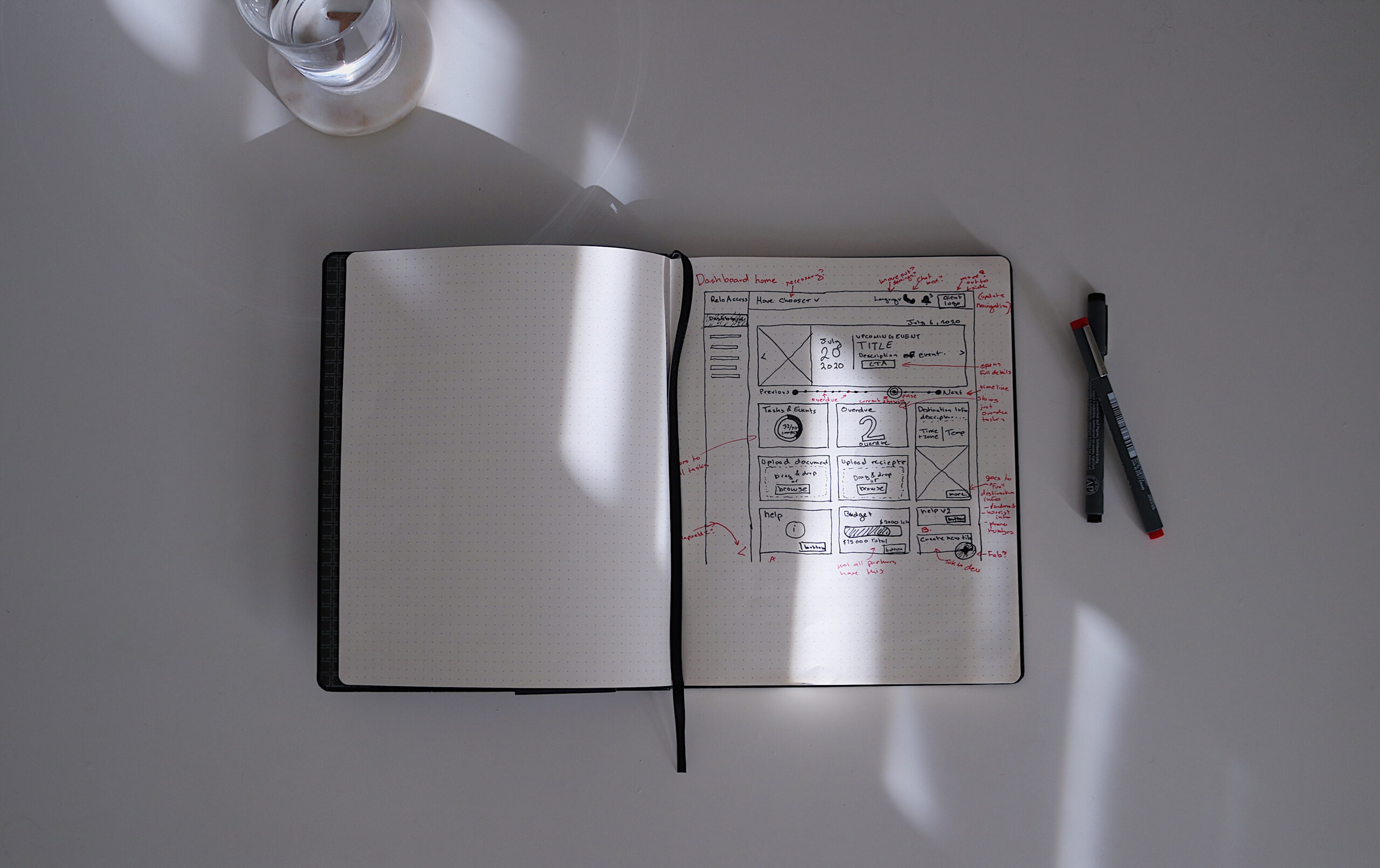
The outdated dashboard needed a refresh. Seldom used widgets were removed and key information was restructured to be more digestible and interactive. A horizontal scroll was introduced for Milestones and Tasks and the employee could now add their flight and address information to their itinerary which could be printed or send to their email. The goal was all-in-one project management combined with a trip management tool.
Calendar & List View
List & Calendar View
List & Calendar View
The previous dashboard was complicated. Both employees and consultant abandoned the dashboard and preferred to communicate tasks over email, meaning we were losing users.
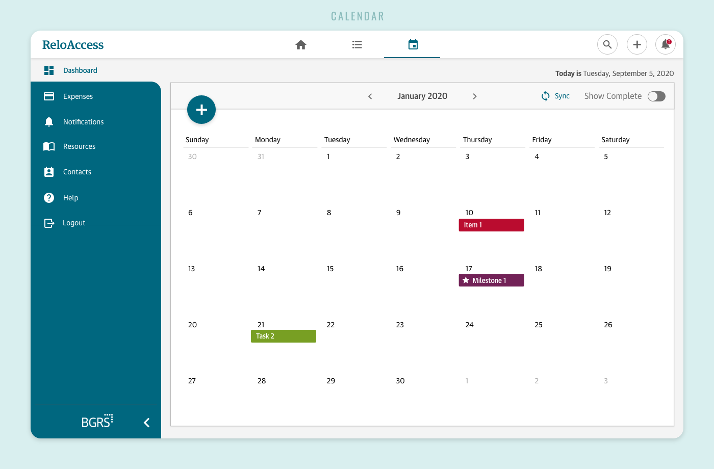
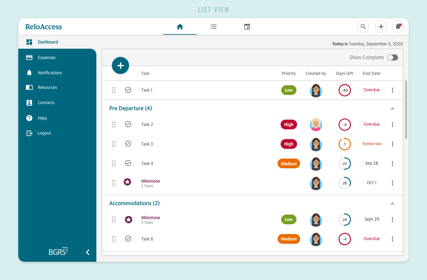
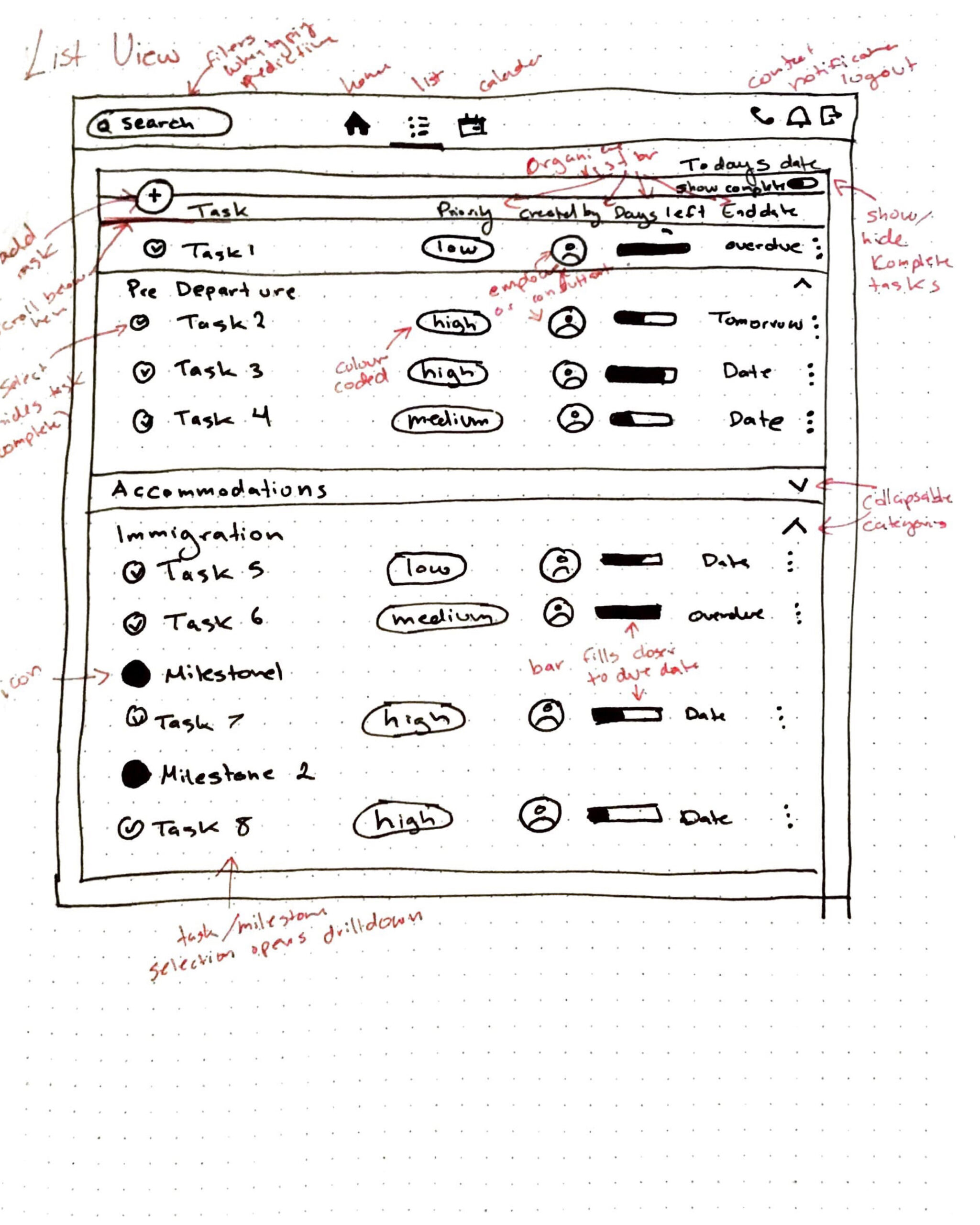
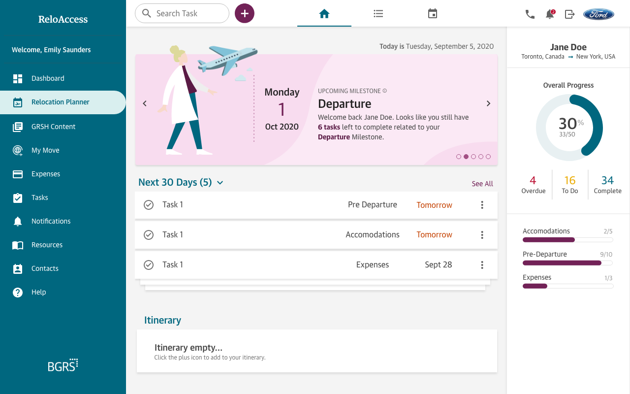
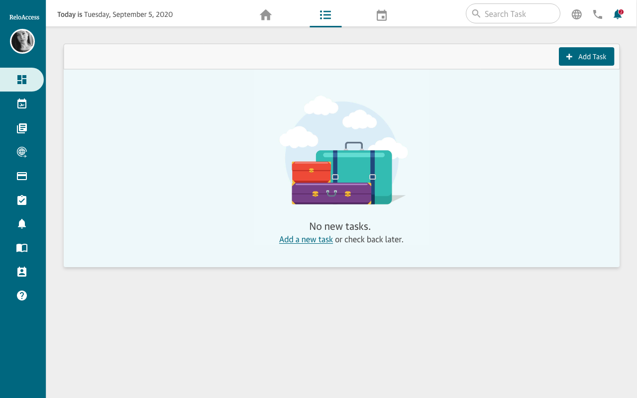
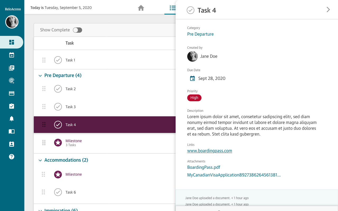
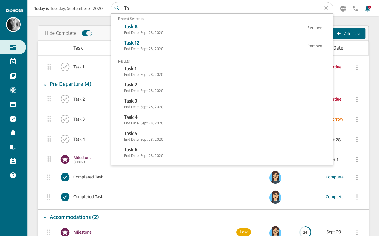
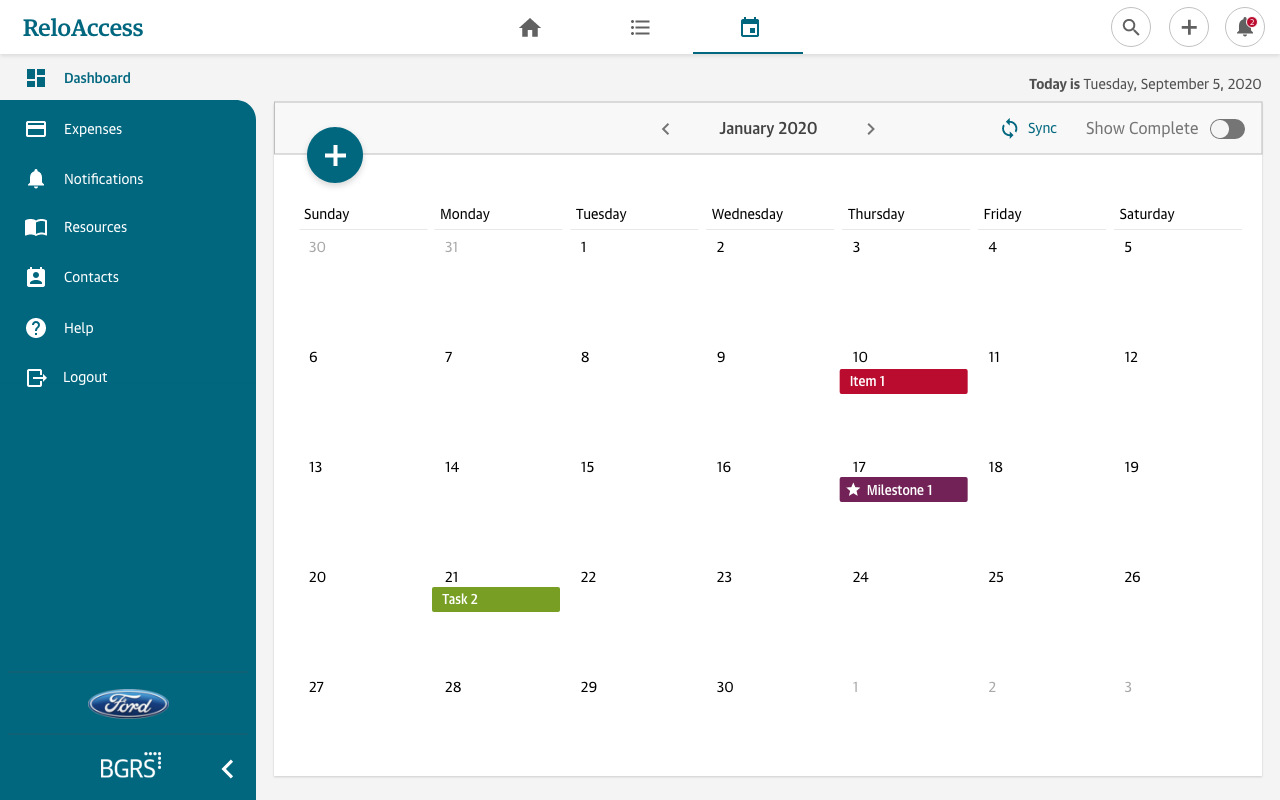
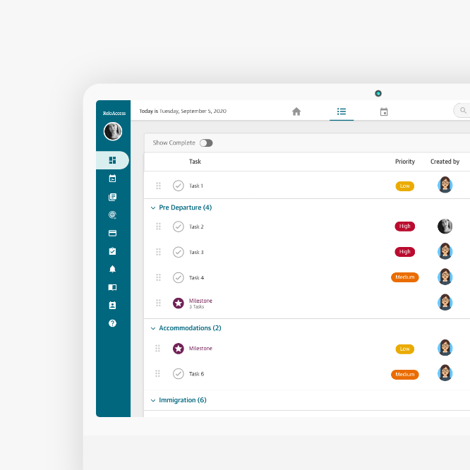
We created a new list and calendar view. The list view acts as a to-do list with a detailed overview of all of the assigned tasks related to relocation. The calendar provides a high-level overview of upcoming tasks.
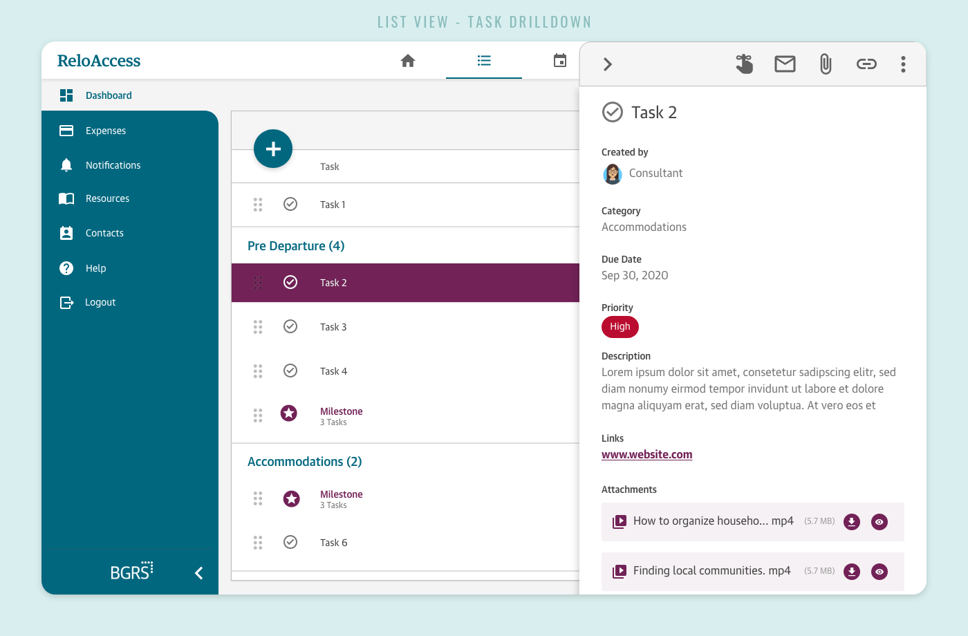
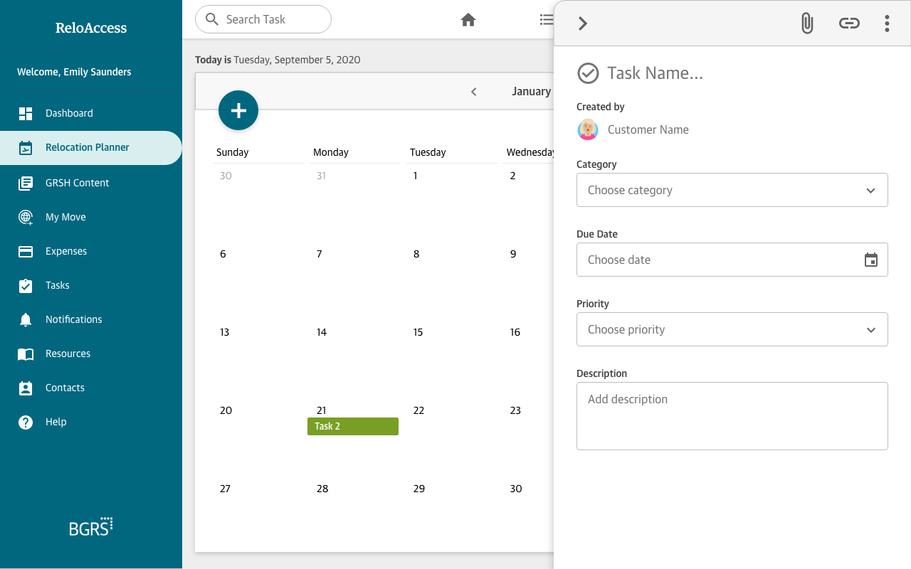
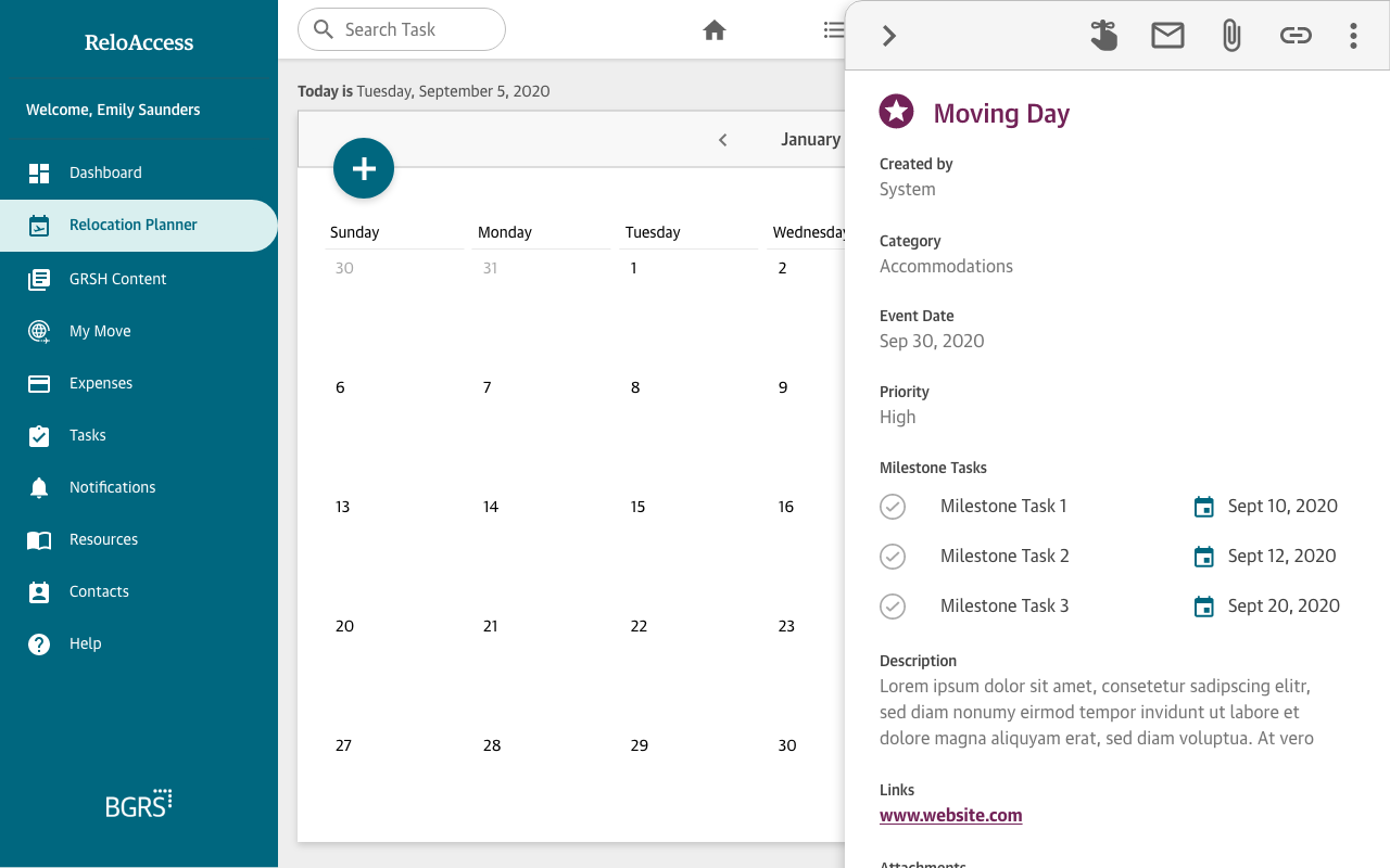
Both the BGRS consultant and employee can add to this list and comment directly on each task in the drilldown. Testing showed that adding new tasks and communication made the site easier, more intuitive and increased usage for both users.
Accessibility
Accessibility
Accessibility
BGRS transfers employees globally that are young, old, speak second languages and use assistive technology, therefore making our dashboard accessible and inclusive to all was a top priority.
By partnering with Fable, we were able to closely follow WCAG standards. We tested our designs with users utilizing a variety of assistive technology such as screen readers, screen magnifiers, voice control and brail keyboards to cater to their specific needs.
Process
Process
Process
The Process
1. Analyze requirements
2. Research best practices,
3. Competitors analysis
4. User interviews
5. Wireframes, flows & prototypes
6. Define functionality
7. Usability testing
8. Iterations
1. Analyze requirements
2. Research best practices,
3. Competitors analysis
4. User interviews
5. Wireframes, flows & prototypes
6. Define functionality
7. Usability testing
8. Iterations
1. Analyze requirements
2. Research best practices,
3. Competitors analysis
4. User interviews
5. Wireframes, flows & prototypes
6. Define functionality
7. Usability testing
8. Iterations
Research
Research
Research
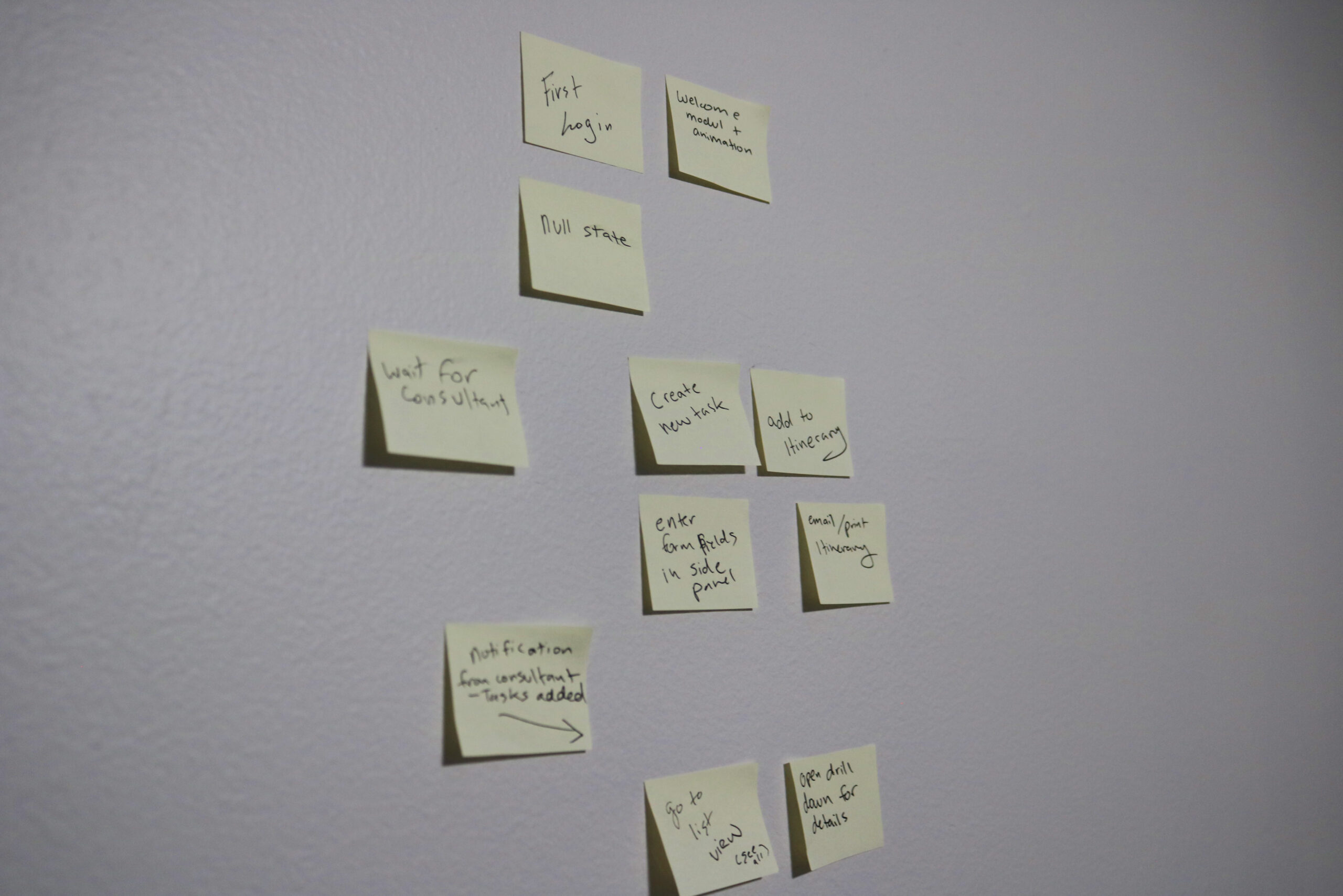
Preliminary research, user interviews and an extensive study on our competitors showed that we were lagging behind in every aspect. Our users were abandoning our platform and resorting to email as a primary form of communication. Tasks had multiple classifications such as: reminders, personal reminders, milestones, and system tasks which led to confusion. It became evident that there were multiple pain points.
Due to our wide target audience, accessibility was a high priority. Through interviews with users of various assistive technology we identified accessibility pain points and increased usability.
Pain points:
1. Losing users to email
2. Users were not logging into the dashboard
3. Confused and overwhelmed when users did log in
4. Complained of boring monochromic UI/UX – “like a static PowerPoint”
5. Too much back and forth in various platforms led to important tasks being lost and forgotten
6. Poor task tracking
Challenges
Challenges
Challenges
1. Wide target audience
2. Acquiring WCAG accessibility certification
3. Increasing simplicity and ease of use
4. Merging old and new functionality
5. Introducing new UI and components
6. Introducing new and interesting interactions
1. Wide target audience
2. Acquiring accessibility certification
3. Increasing simplicity and ease of use
4. Merging old and new functionality
5. Introducing new UI and components
6. Introducing new and interesting interactions
Solution
Solution
Solution
We continued to iterate by conducting interviews with users that utilized various assistive technology. We paid close attention to colours, contrast, text sizes, clickable areas, proper coding using H1, H2, H3 etc and aria labeling. This enabled us to tailor the design to a wider target audience by following WCAG AA standards.
The entire UI and UX needed an overhaul, and through preliminary research we identified the employee’s top goals. We removed unused widgets from the previous design, and streamlined the task completion process. In order to easily intake information and ensure tasks were being monitored and completed, we introduced home, list and calendar views. We condensed “reminders”, “personal reminders”, “tasks” and “milestones” to tasks and milestones. Once communication was streamlined in this manner, employees and BGRS consultants were again using the dashboard and leaving email as a secondary form of communication.
MVP's
MVP's
MVP's
As the scope increased we had to determine MVP's to generate a proof of concept before moving on to the nice-to-haves. Through close collaboration with the lead developer, business analyst and project manager we identified the MVP’s to meet sprint deadlines, release dates and to gather a more accurate proof of concept for all stakeholders.
Outcome
Outcome
Outcome
This was a really exciting project for me to work on. As the UX lead, I conducted the research, interviews and directed the outcome of the UI and experience. Communication was streamlined and employees and BGRS consultants were once again using the dashboard and leaving email behind. One of the most difficult parts was merging the flow of the employee, consultant and client views of the dashboards with our existing structure seamlessly. The focus on accessibility gave me new and extremely useful insight to users whom I had not had the opportunity to interview before.
Scroll down to see a few screens as they are developed into the final product.

Next Steps
Next Steps
Next Steps
Consultant dashboard view
Client dashboard view
Learnings
Learnings
Learnings
Always fight for good UX
I was lucky to have a large say in the outcome of the project. The UI was going through an update for the entire website which provided a lot of flexibility for new components. Some developers were reluctant to introduce new custom components but fighting for what I believe is essential to having a good user experience led to a final product that ultimately tested well.
Adapting to changing requirements
The new dashboard generated a ton of excitement within the company, but our ambition blinded us and delayed the launch. New timelines, resourcing issues, and reprioritization meant the scope of the project was constantly changing. I had to adapt to those changes and still deliver the best possible design in time with tight deadlines.
Accessibility is underrated
According to the Pew Internet Project, survey conducted by Princeton Survey Research Associates International, Jan. 2011, 54% of adults living with a disability go online. The Census Bureau on July 25, 2012 found that 38.3 million (12.6%) have a severe disability. We partnered with Fable and through interviews learned about different types of assistive technology. Users provided us with demonstrations of how they used their technology as well as testing the usability of our new dashboard features. This was extremely insightful. Such things as large clickable areas, colours, contrast, text size, scroll bars play and surprisingly coding proper “H1” headings proved to provide a far superior user experience.
YEAR
2020
ROLE
UX Designer
CLIENT
BGRS
ABOUT CLIENT
BGRS offers software and services that help facilitate employee relocations globally.
More Work
Clear SignUX | WEB APP
BGRS DashboardUX | DASHBOARD
PromoPagesPromoPages Campaign
Vertical AdvisorUX | Product | Marketing


