YEAR
2024
ROLE
Sr. UX Designer
CLIENT
Amrock & Rocket Mortgages
ABOUT CLIENT
Amrock is a subsidiary of Rocket Companies that manages the title services and closing of the mortgage process.
OVERVIEW
OVERVIEW
OVERVIEW
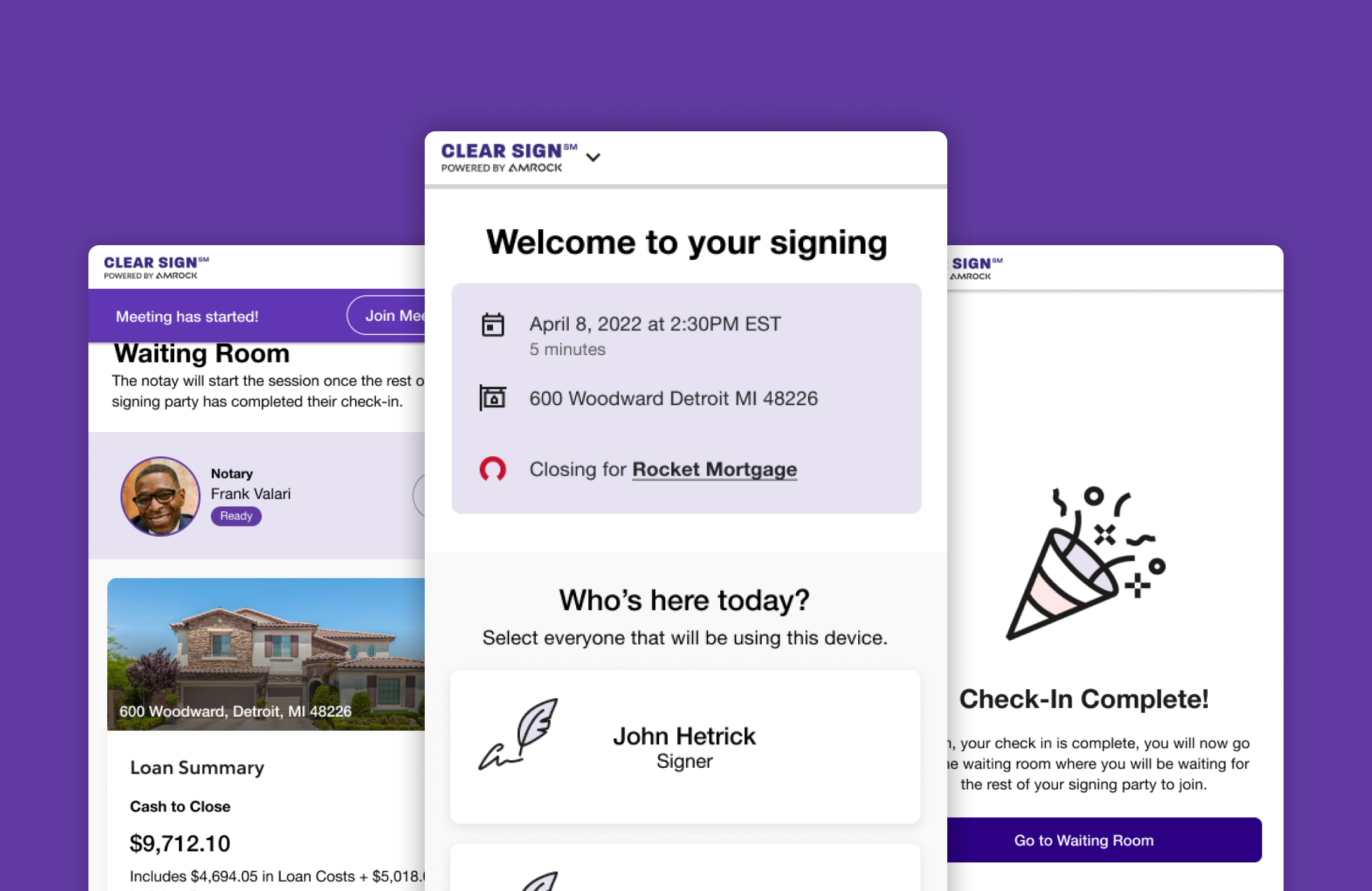
Clear Sign is a web application that revolutionizes the home buying experience by enabling remote online closings for clients under Rocket Mortgages. This innovative platform brings notaries and signing parties together on a secure video call, making the final steps of the home purchase process efficient and convenient. With Clear Sign, users can now complete their transactions from the comfort of their homes, eliminating the need for in-person meetings and paperwork.
Clear Sign is a web application that revolutionizes the home buying experience by enabling remote online closings for clients under Rocket Mortgages. This innovative platform brings notaries and signing parties together on a secure video call, making the final steps of the home purchase process efficient and convenient. With Clear Sign, users can now complete their transactions from the comfort of their homes, eliminating the need for in-person meetings and paperwork.
Key Pain Points
Key Pain Points
Key Pain Points
Key Pain Points
Key Pain Points
1. Lengthy and confusing onboarding
2. Limited mobile responsiveness
3. Lack of accessibility features
4. Complex authentication process
5. Confusing terminology and language
6. Lack of progress feedback
7. Frequent support calls overwhelmed lines
8. Lack of personalization
1. Lengthy and confusing onboarding
2. Limited mobile responsiveness
3. Lack of accessibility features
4. Complex authentication process
5. Confusing terminology and language
6. Lack of progress feedback
7. Frequent support calls overwhelmed lines
8. Lack of personalization
1. Lengthy and confusing onboarding
2. Limited mobile responsiveness
3. Lack of accessibility features
4. Complex authentication process
5. Confusing terminology and language
6. Lack of progress feedback
7. Frequent support calls overwhelmed lines
8. Lack of personalization
1. Lengthy and confusing onboarding
2. Limited mobile responsiveness
3. Lack of accessibility features
4. Complex authentication process
5. Confusing terminology and language
6. Lack of progress feedback
7. Frequent support calls overwhelmed lines
8. Lack of personalization
1. Lengthy and confusing onboarding
2. Limited mobile responsiveness
3. Lack of accessibility features
4. Complex authentication process
5. Confusing terminology and language
6. Lack of progress feedback
7. Frequent support calls overwhelmed lines
8. Lack of personalization
Summary
Summary
Summary
Problem: The original Clear Sign application was not usable, leading to a cumbersome and confusing check-in process that resulted in a high volume of support calls. The application lacked personalization and needed humanization to enhance the user’s closing journey. Additionally, the outdated signing room required a major update, and users lacked clear guidance on their next steps after completing the process.
Role: As a UX designer tasked with the redesign of Clear Sign, my primary challenge was to create a seamless, clear, and accessible user experience that addresses pain points and improves overall usability. The existing application faced issues such as a complex check-in, limited mobile responsiveness, and a lack of accessibility features. Additionally, the frequent need for users to call customer support overwhelmed the support lines and led to cancellation forcing the user to drop to paper.
Objective: The goal of this redesign was to prioritize a mobile-first approach, ensure clarity and conciseness in information presentation, enhance accessibility for all users, and evoke desirability through emotional design elements. The successful redesign aimed to streamline the remote online closing process, reduce user frustration, and optimize the platform's performance. By implementing user-centered design principles and addressing identified pain points, the redesigned Clear Sign would provide a delightful and secure experience for all parties involved in home purchases under Rocket Companies.
Clear Sign Progression
Clear Sign Progression
Clear Sign Progression
Clear Sign Progression
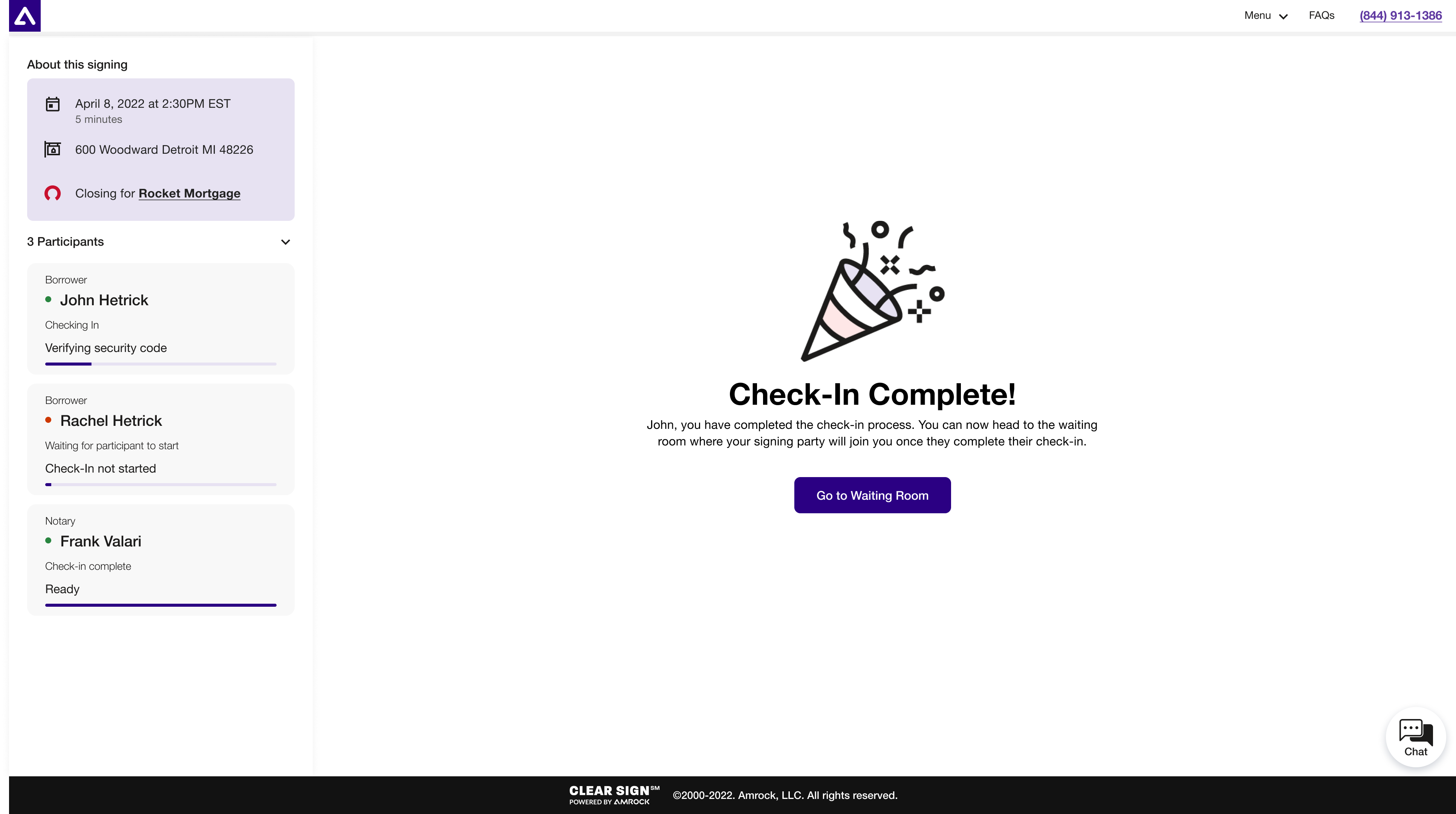
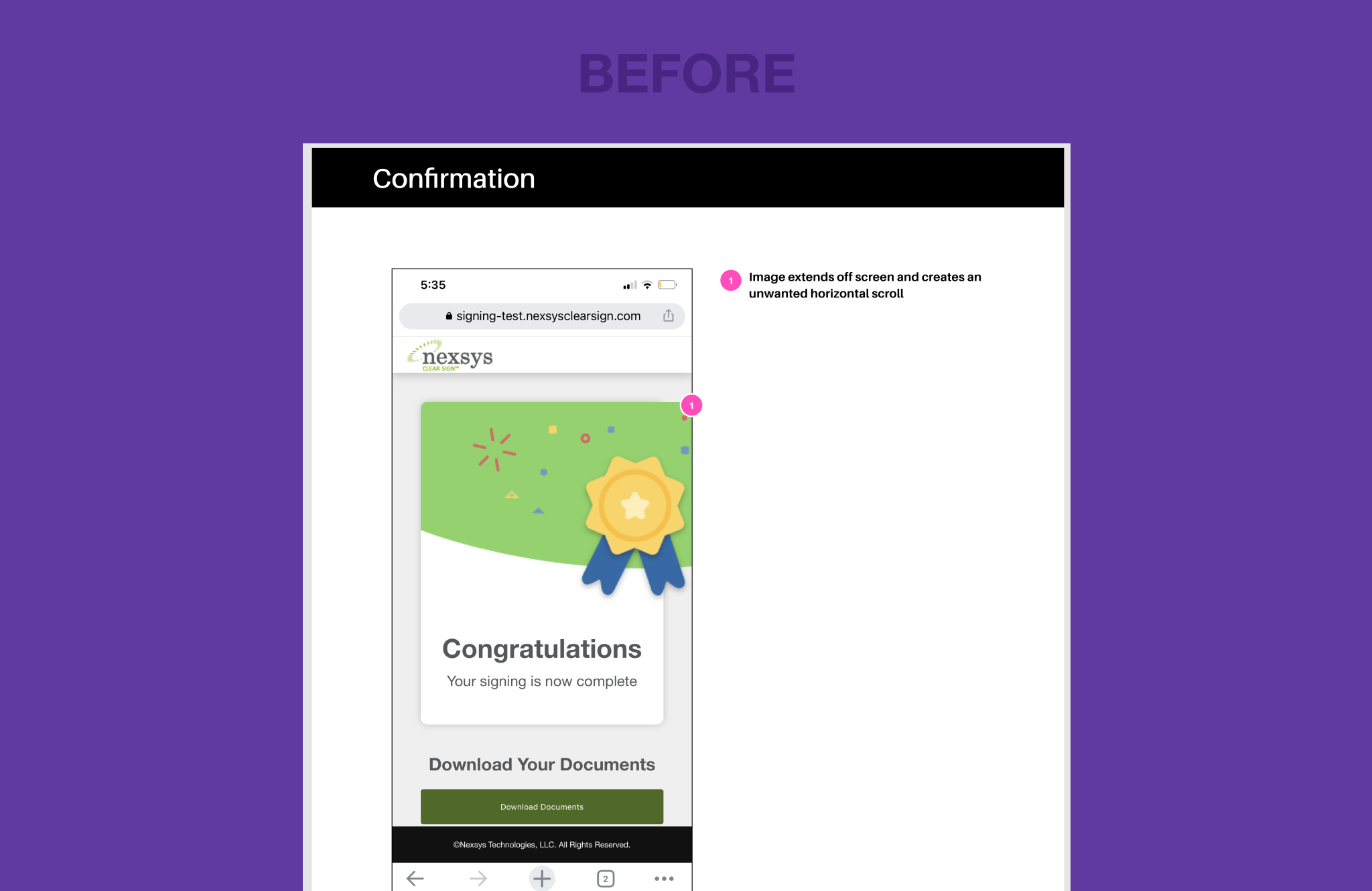
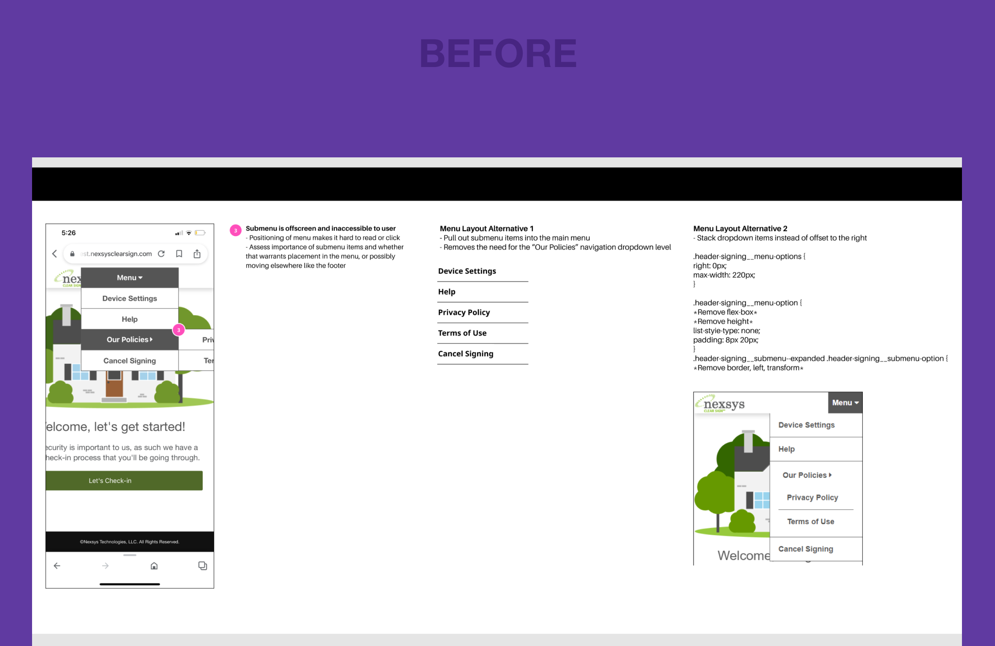
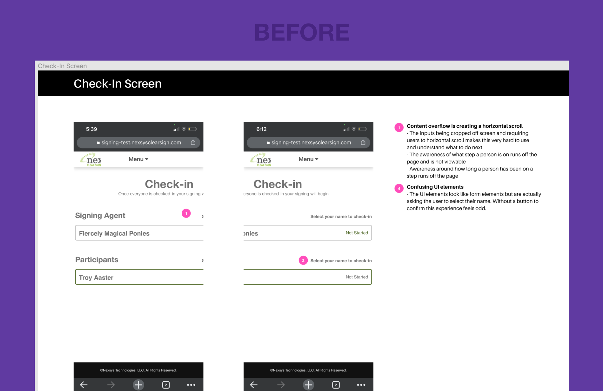
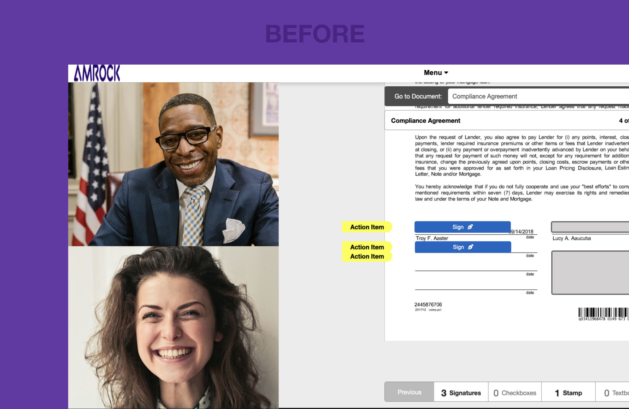
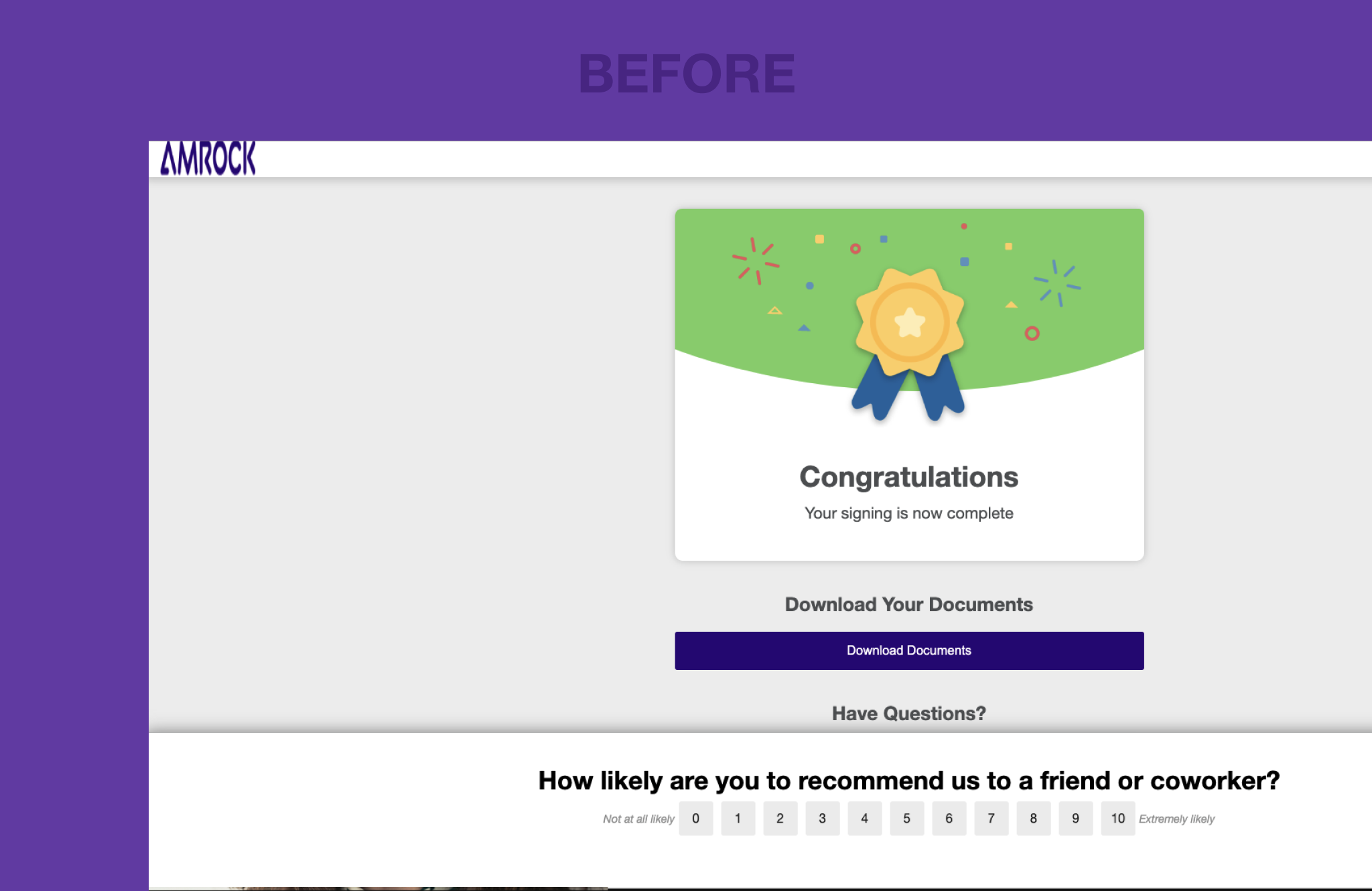
CS 1.0: The initial version was not mobile responsive and difficult to use. The design was cluttered and not align with our brand. We performed emergency triage to make it minimally usable.
CS 1.5: More significant UX and branding updates were implemented, making the app more user-friendly and bringing it closer to Rocket Mortgage's branding.
CS 2.0: A completely redesigned app with major improvements, including a more intuitive interface, a streamlined check-in process, a reimagined signing room, enhanced with personalization and humanization.

Mobile First
Mobile First
Mobile First
Mobile First
Pain Point: The original design was not optimized for mobile devices, leading to a poor user experience on smartphones and tablets.
Solution: Implemented a mobile-first redesign, optimizing screen layouts, prioritizing essential features, and designing intuitive touch interactions. Users now enjoy improved readability, navigation, and usability, resulting in a more convenient and enjoyable remote online closing experience.
Clear and Concise
Clear and Concise
Clear and Concise
Clear and Concise
Pain Point: Confusing terminology and complex technical language confused users unfamiliar with the home closing process and legal terminology.
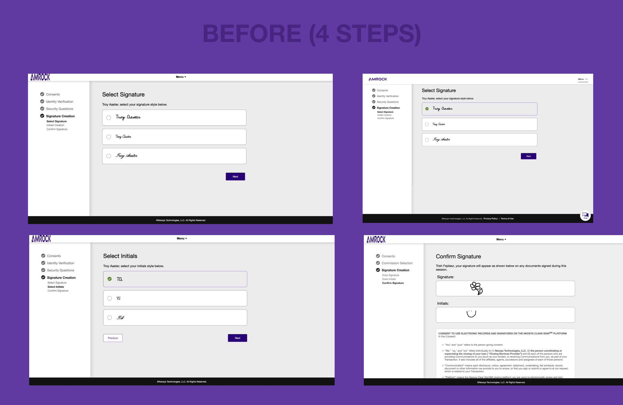
Solution: Restructured the information architecture for clarity and conciseness. Streamlined information flow by eliminating uncessary steps and used clean, minimalist design principles to highlight essential elements. Users could now focus on the most critical tasks without feeling overwhelmed.
Simplified QR Code
Simplified QR Code
Simplified QR Code
Simplified QR Code
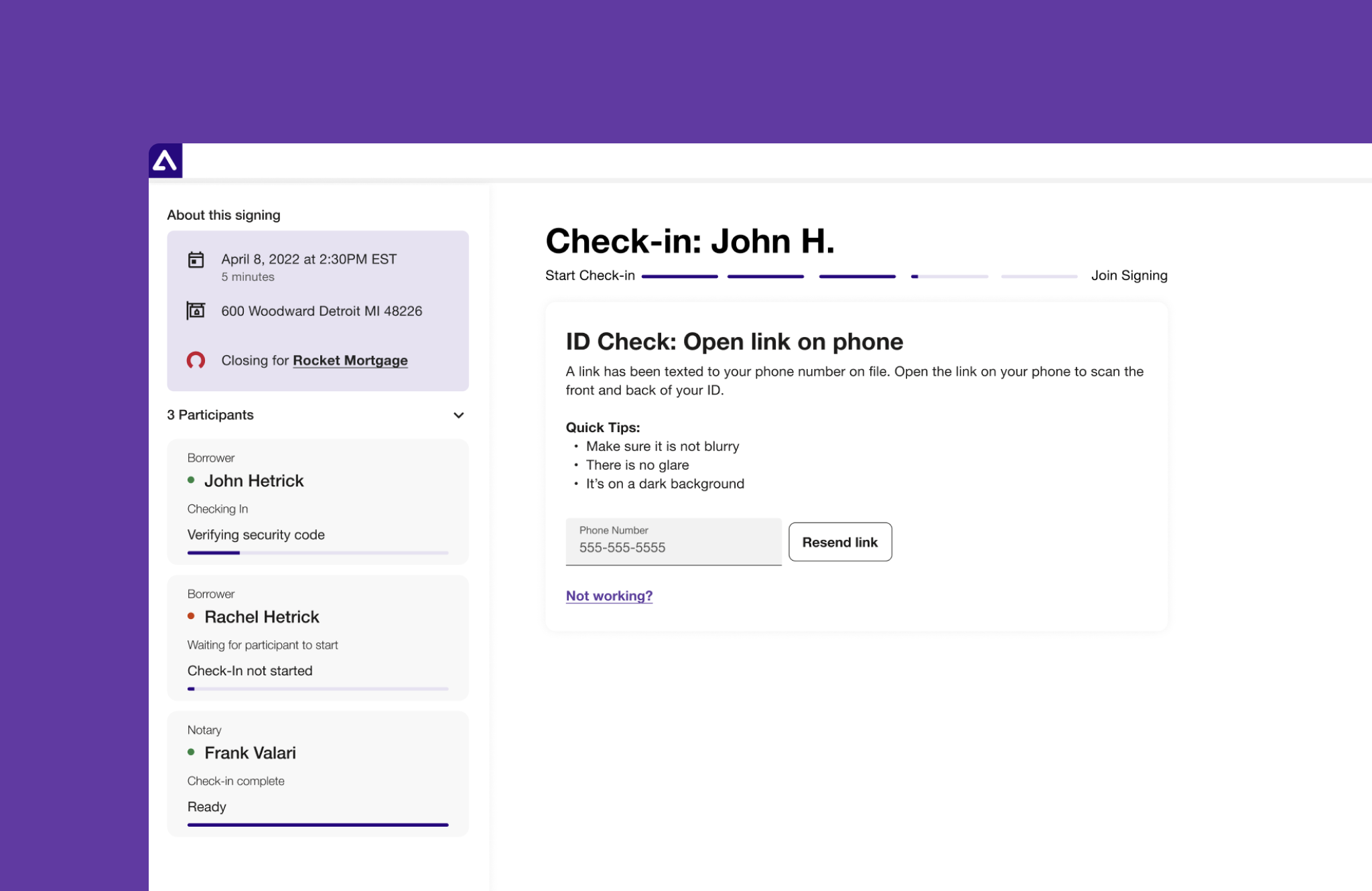
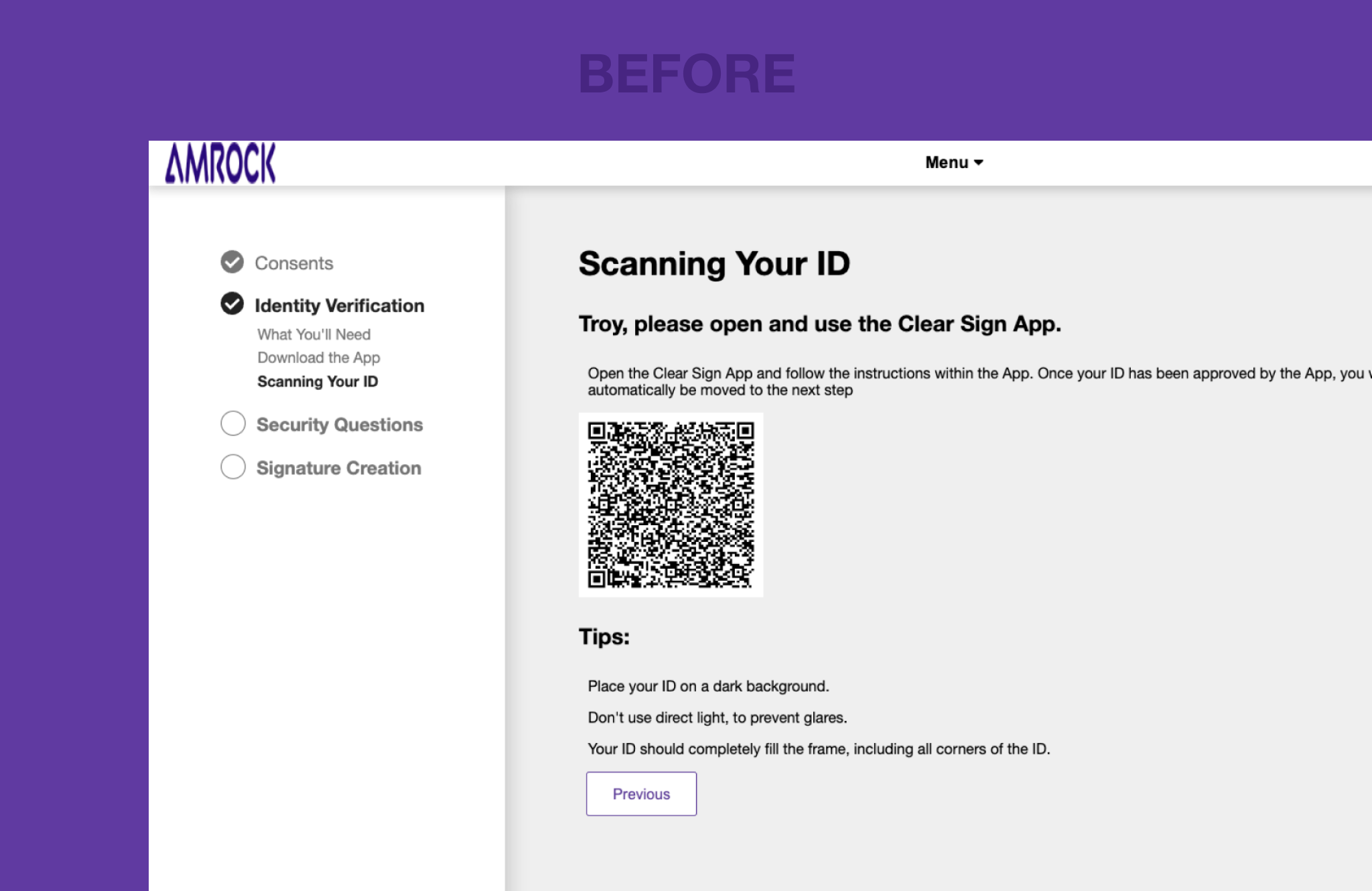
Pain Point: Users had difficulty scanning a QR code on their desktop with their mobile phones, leading to high support call volumes. This caused frustration and delays in receiving support, hindering a smooth remote online closing experience.
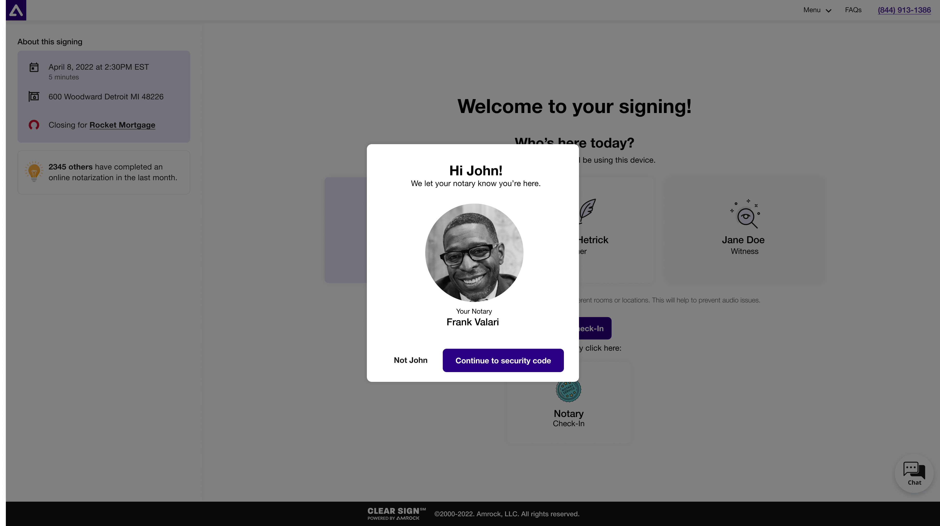
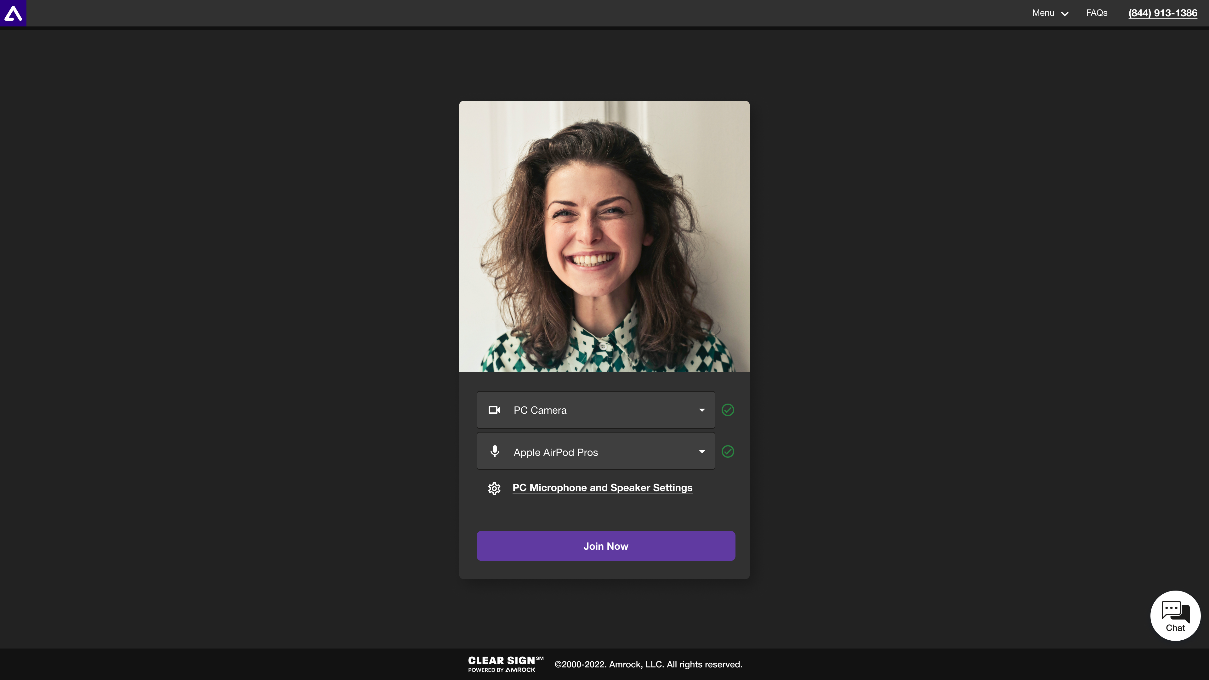
Solution: Introduced an alternate method to receive the URL by text. The link is texted to the phone number on file to launch the ID verification process on their device, allowing users to verify their ID on mobile phones without QR code scanning.
This reduced QR code-related support calls from 14% to less than 1%.
Easier KBA Questions
Easier KBA Questions
Easier KBA Questions
Easier KBA Questions
Easier KBA Questions
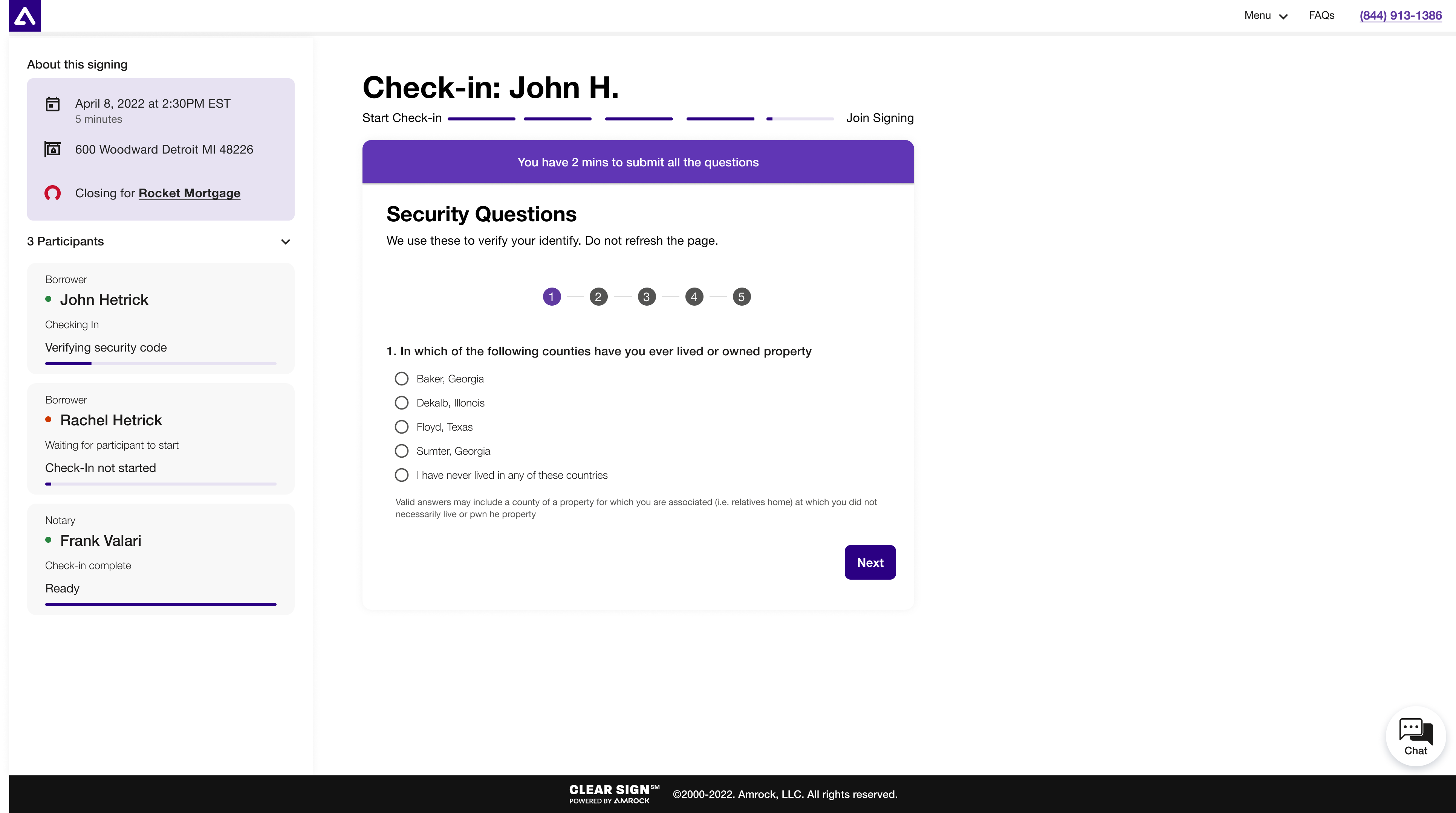
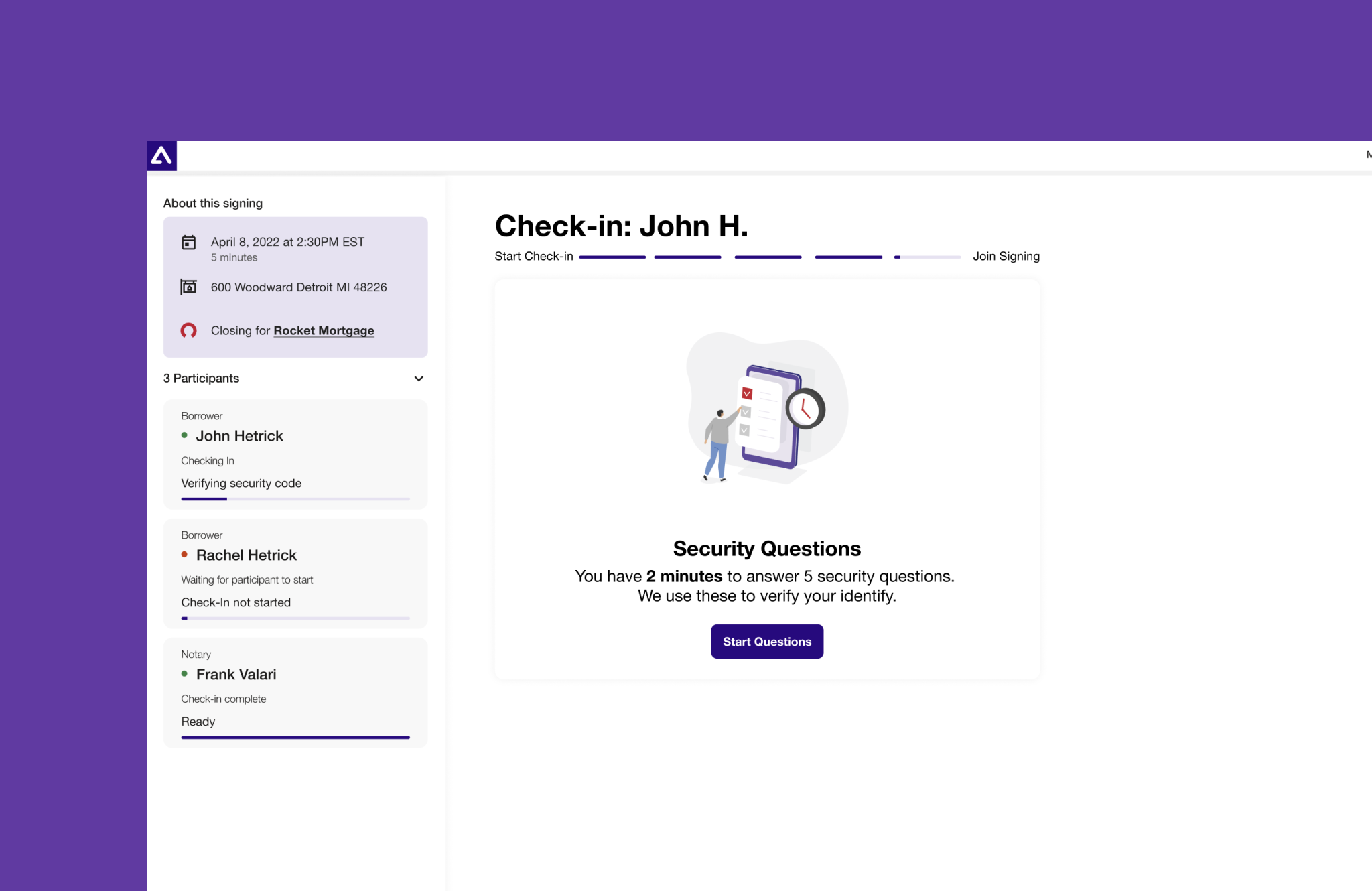
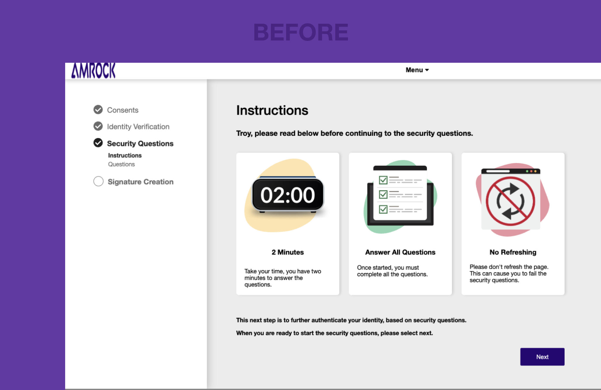
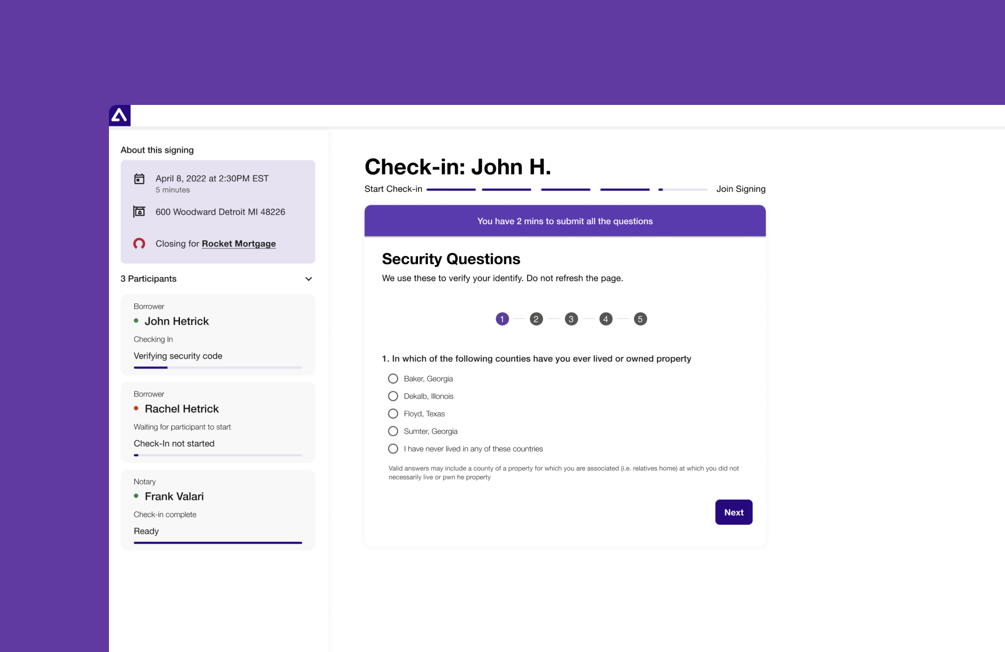
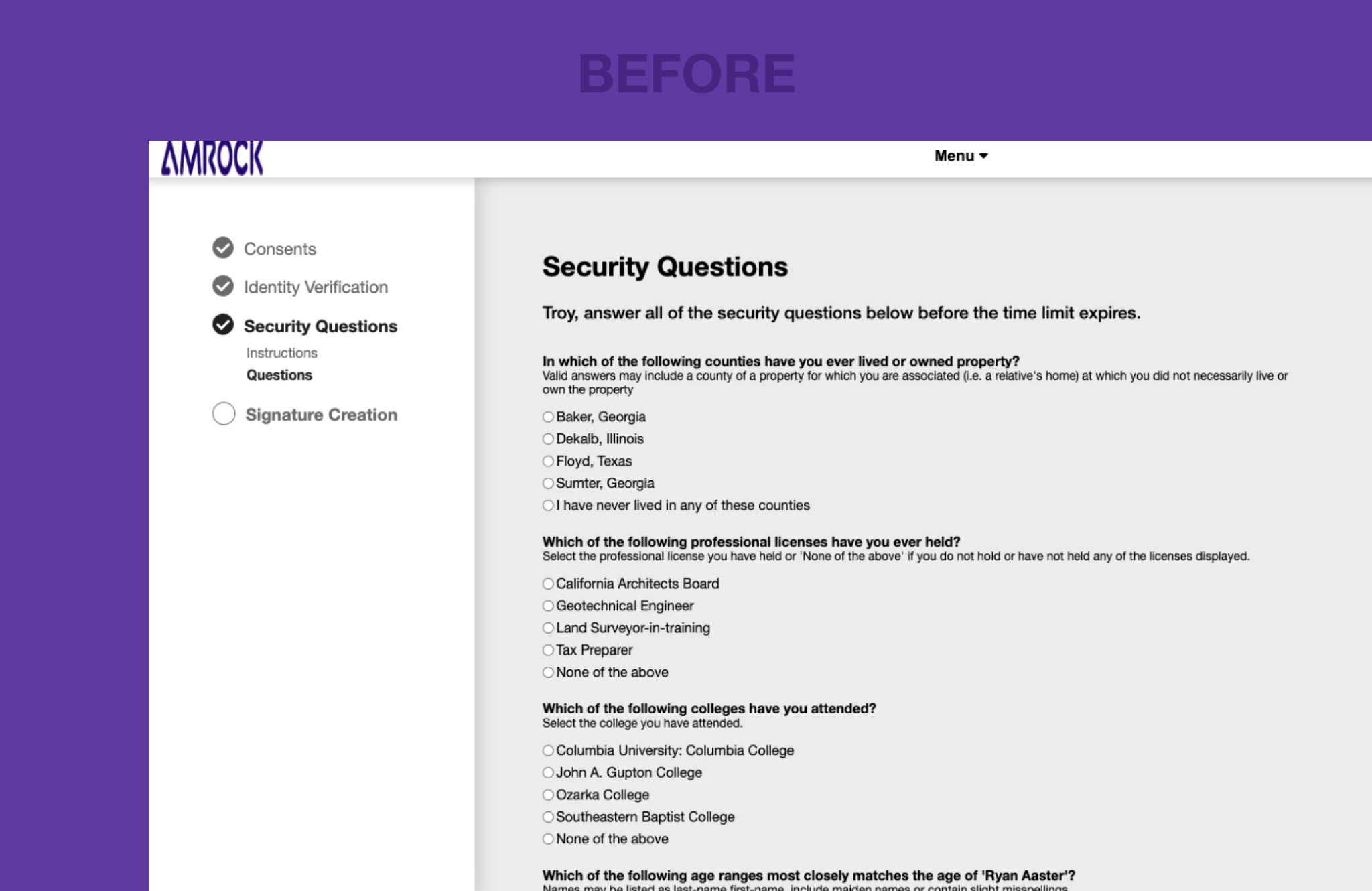
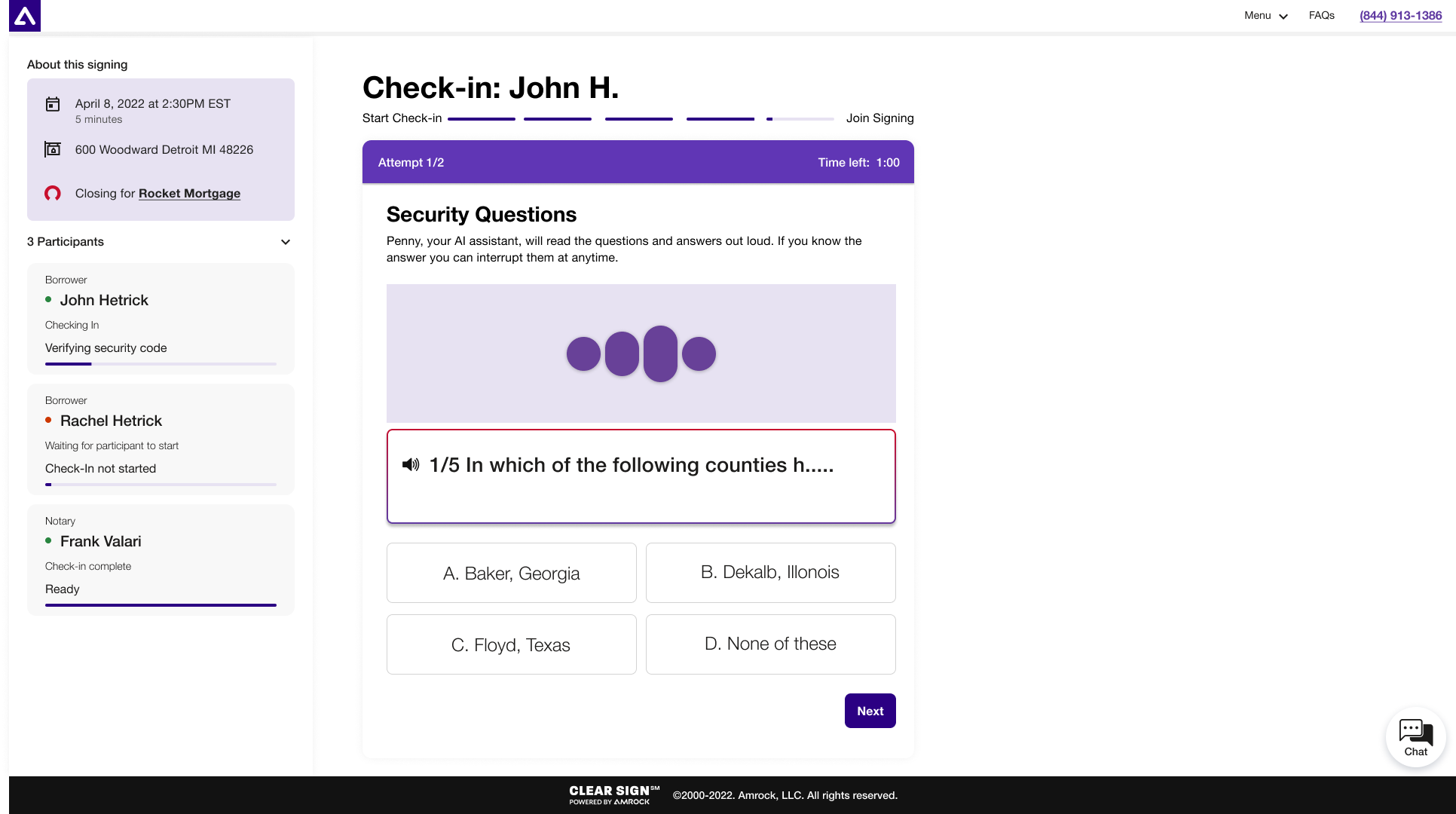
Pain Point: The previous version displayed Knowledge-Based Authentication (KBA) questions on a single scroll page without a 2-minute timer visible. This was causing frustration, failed attempts and as a result cancelled signings.
Solution: Enhanced the KBA experience by presenting the questions one at a time with a visible 2-minute timer, reducing cognitive load, stress and improving accessibility resulting in a smoother and more user-friendly closing experience.
Terms and Conditions
Terms and Conditions
Terms and Conditions
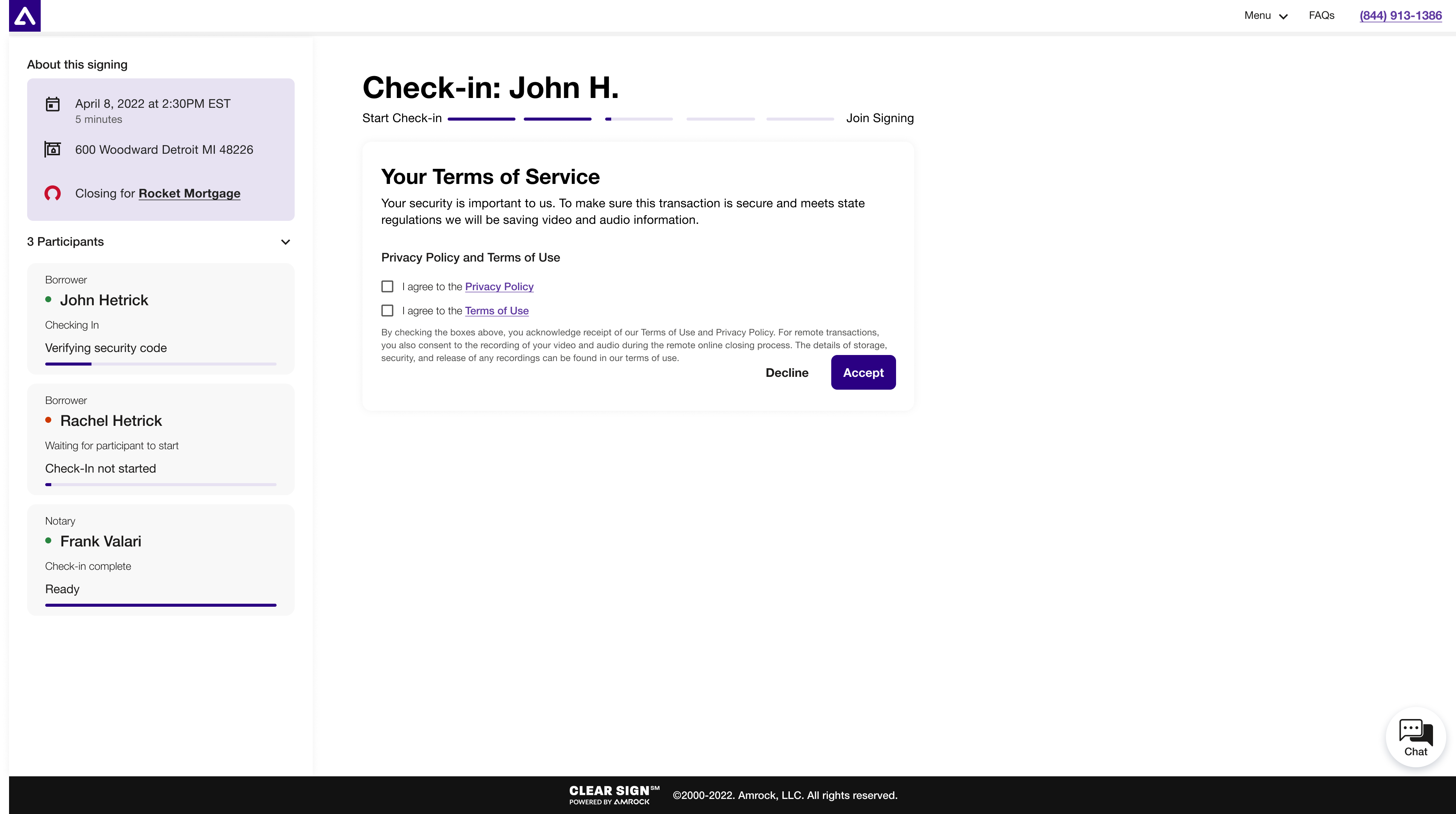
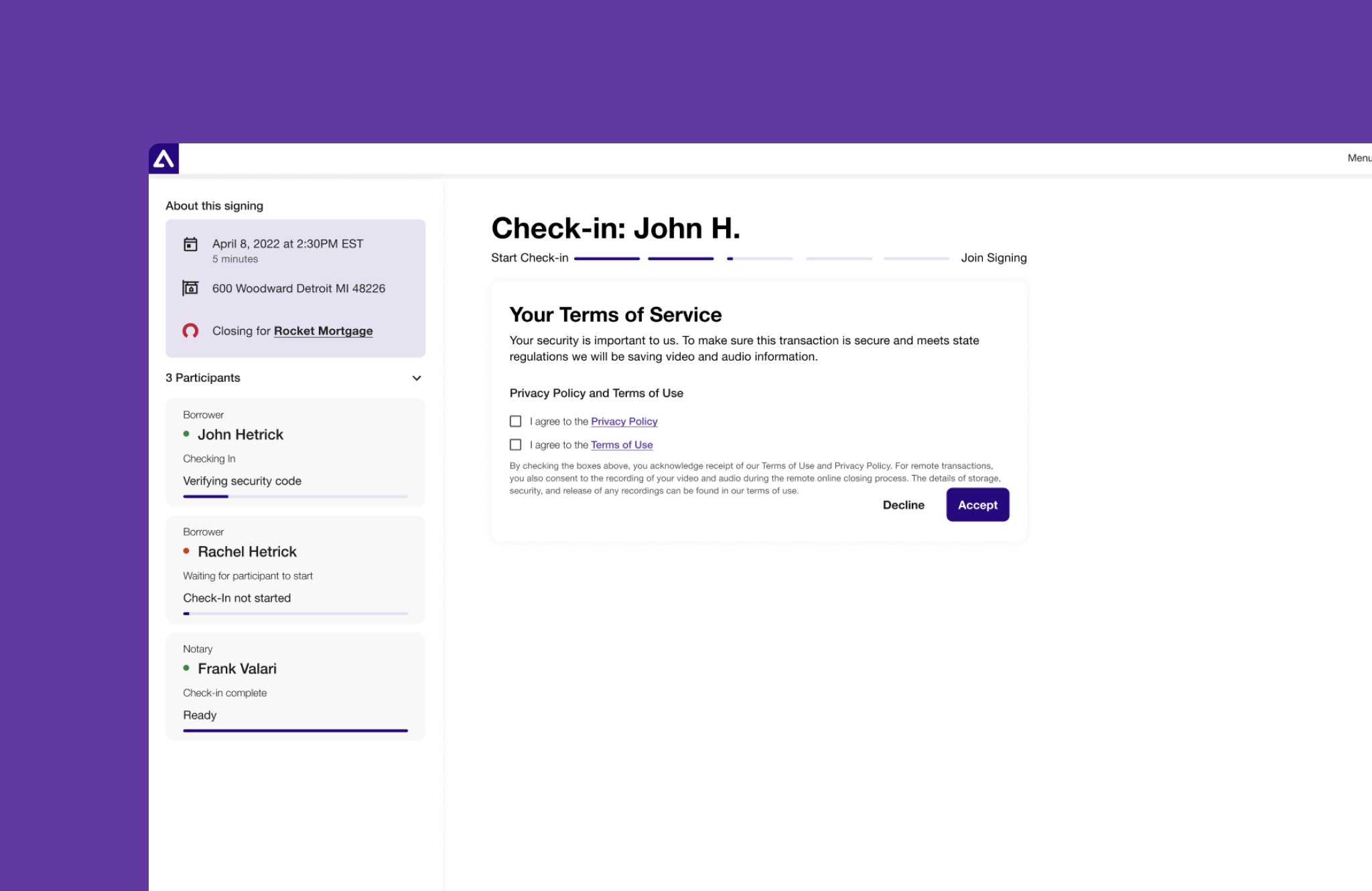
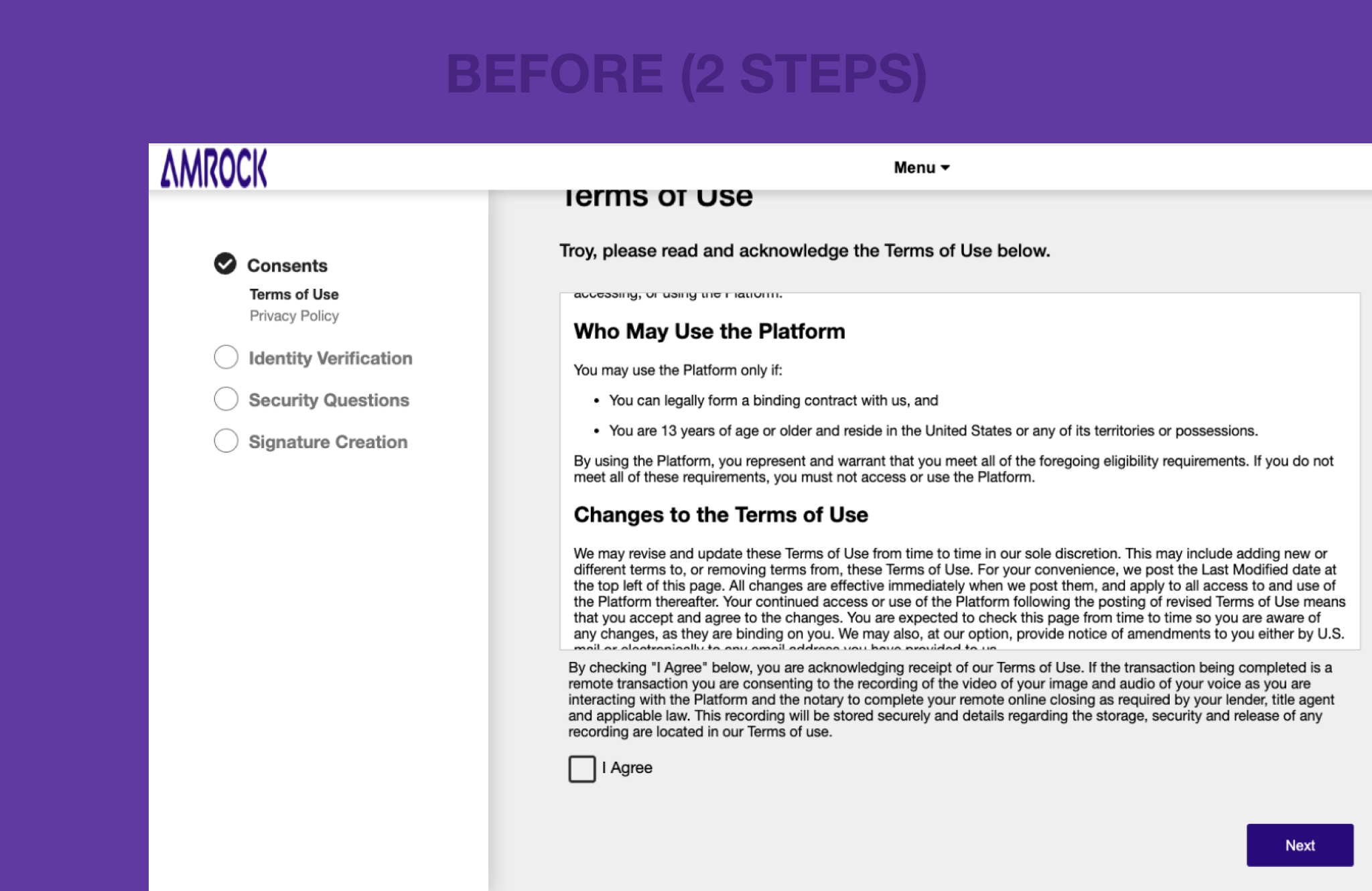
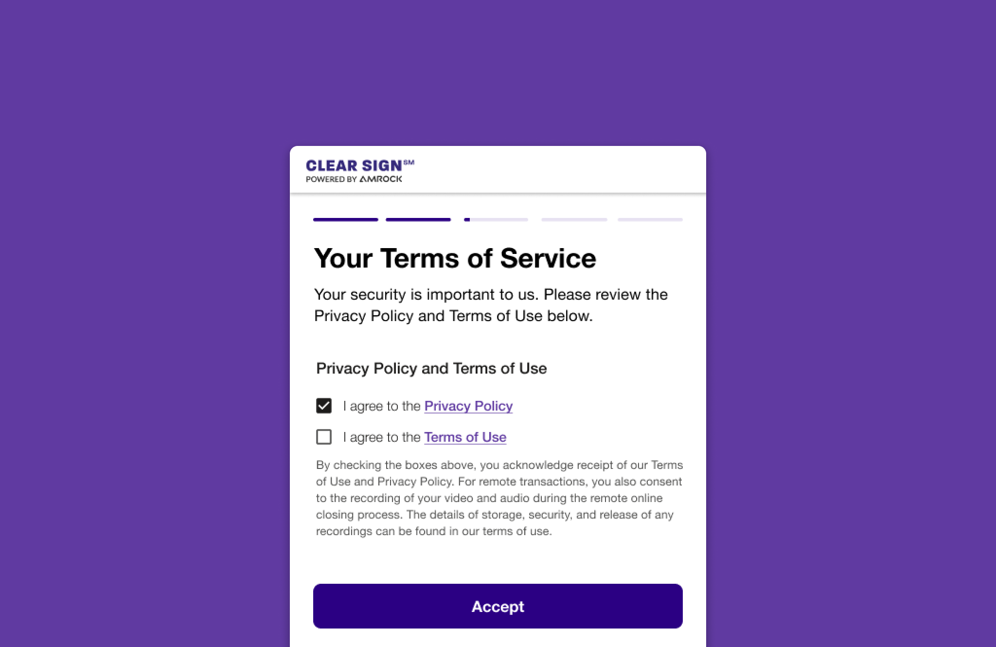
Pain Point: Separate Terms of Use and Privacy Policy pages caused cognitive overload and lengthened the check-in process.
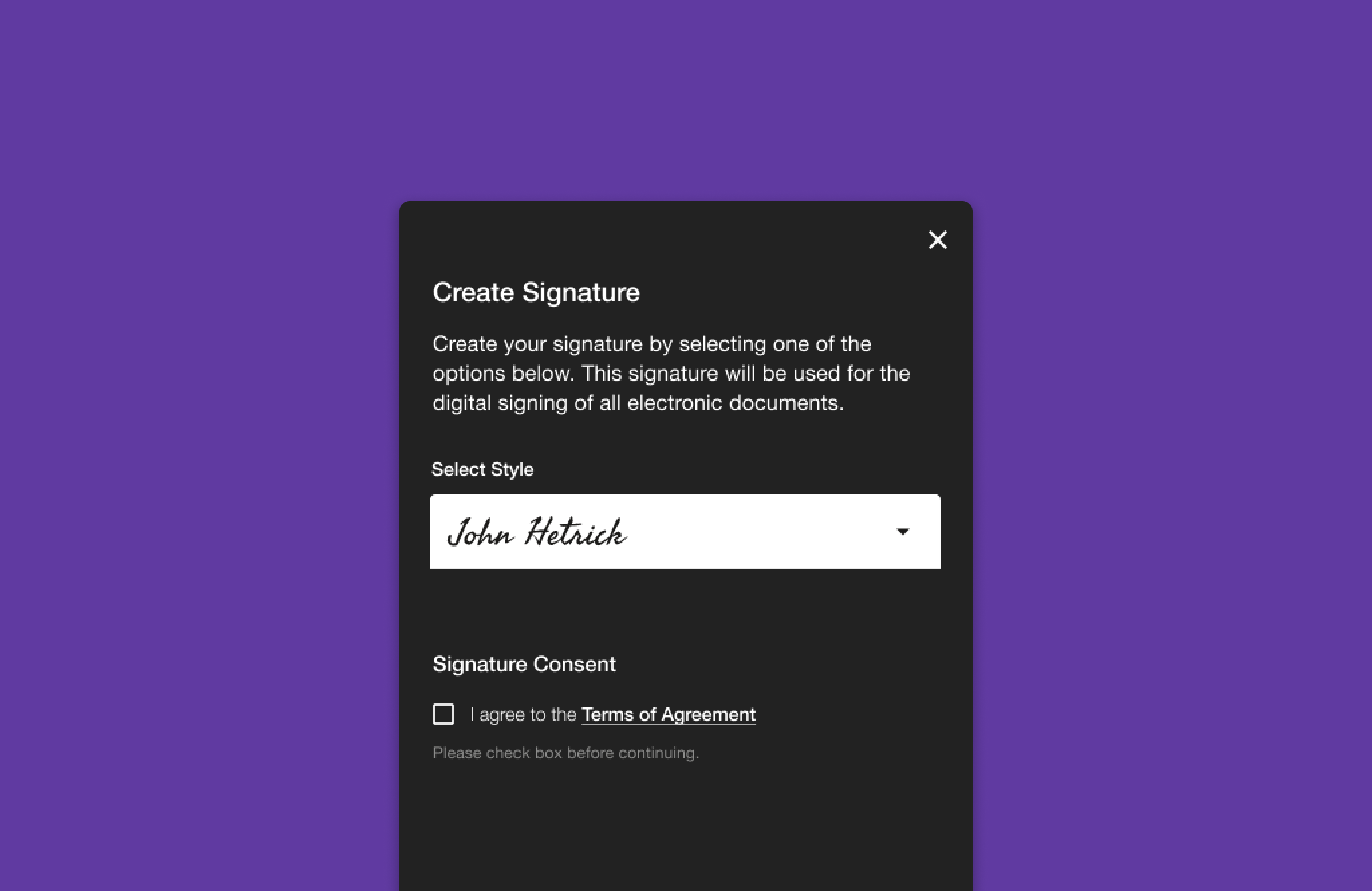
Solution: Combined the Terms of Use and Privacy Policy into one page with clickable links expanding into modals. Users now agree through two checkboxes, and don't see the entire contract unless desired. This streamlined and simplifying the process by reducing cognitive load and anxiety.
Chat Feature
Chat Feature
Chat Feature
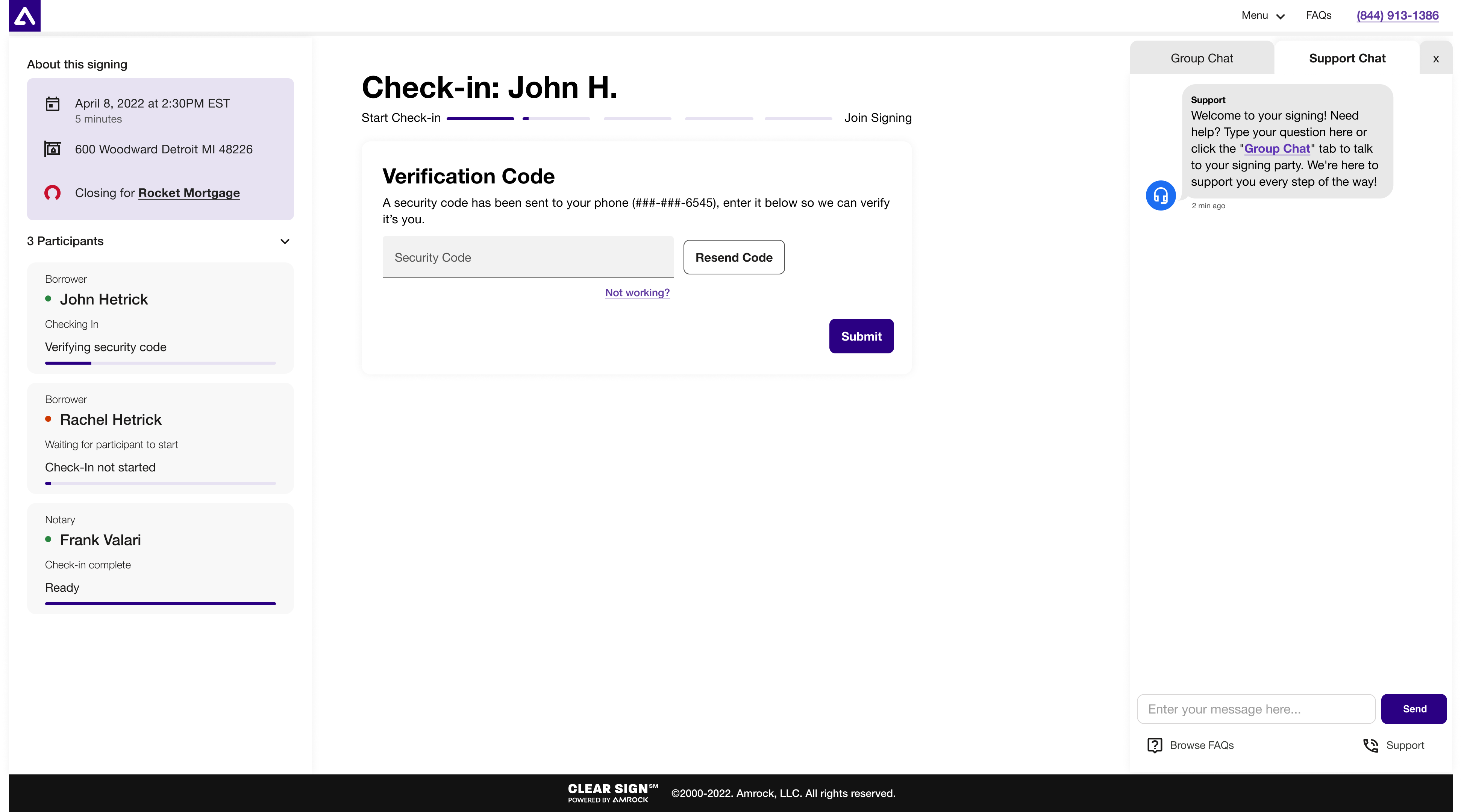
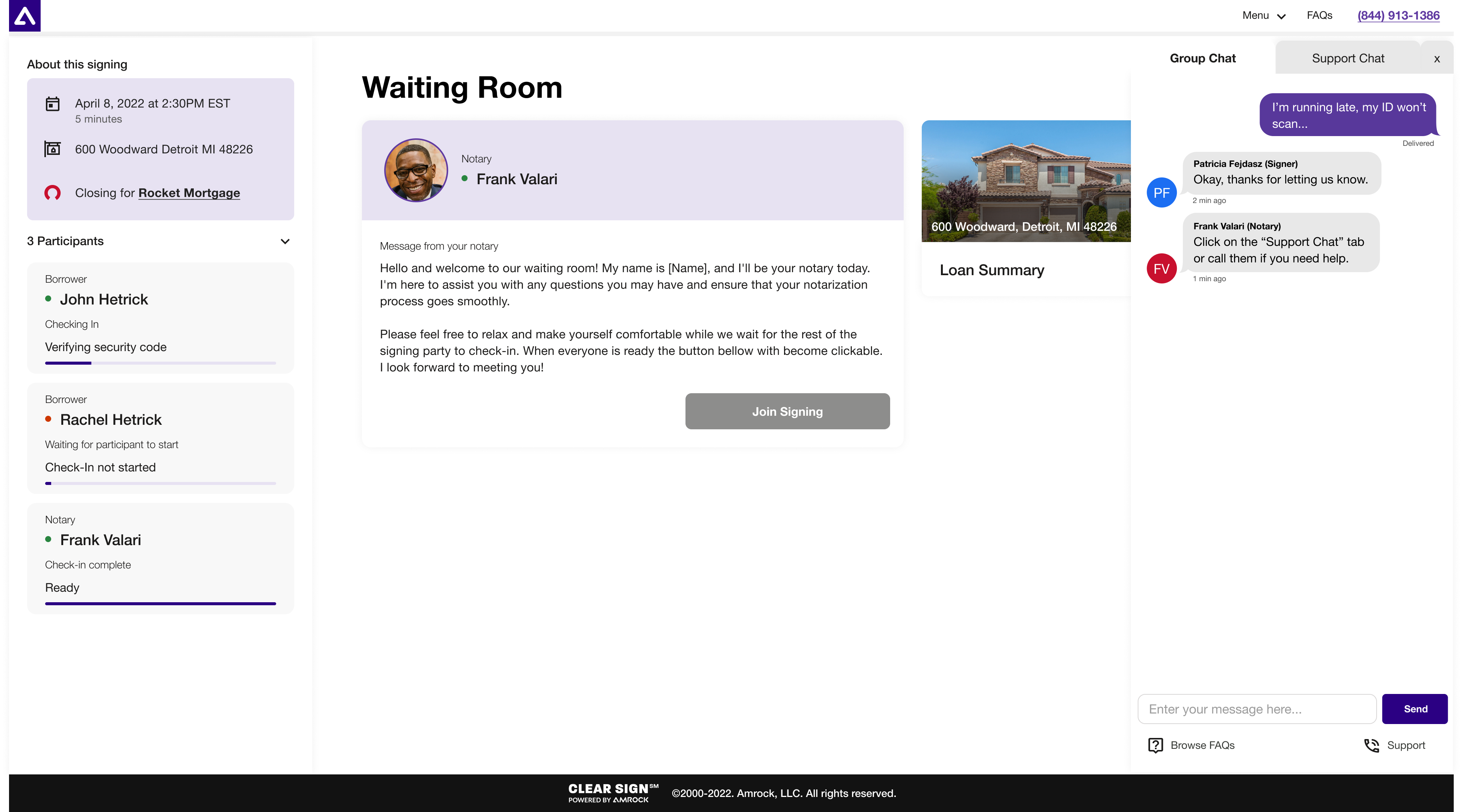
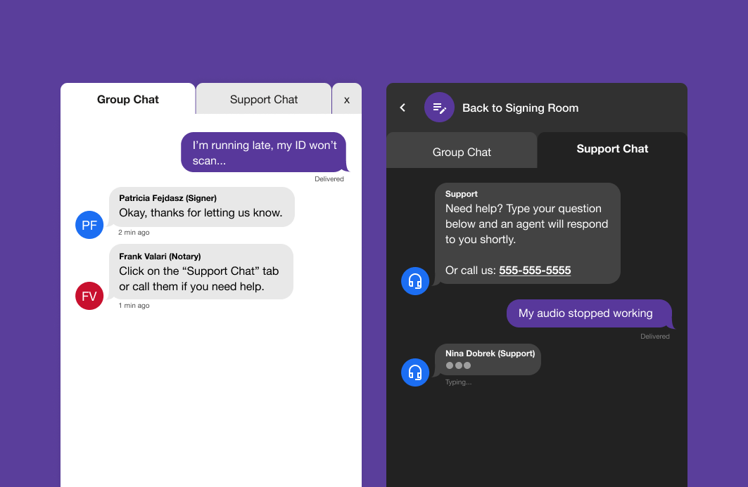
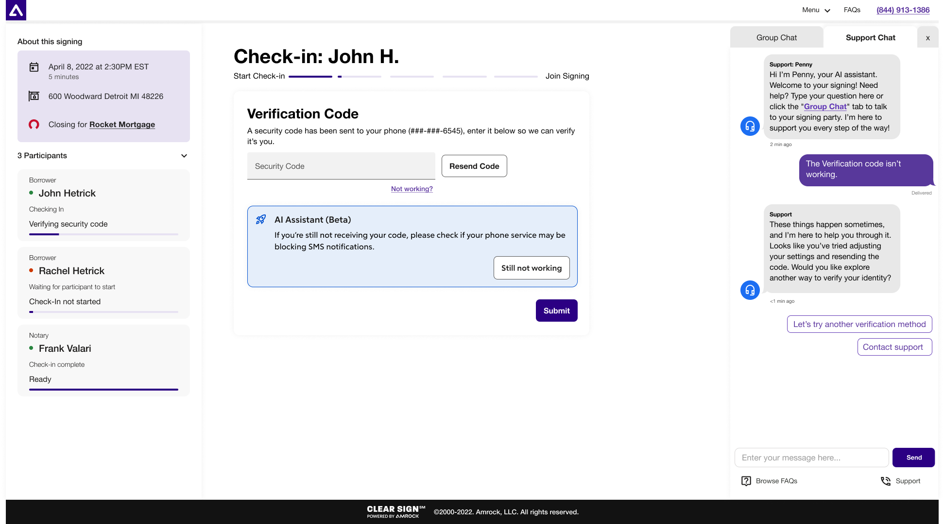
Pain Point: Ineffective communication during check-in and signing sessions between the signing party, notary, and support led to frustrations and delays. Audio issues and unknown phone numbers further disrupted the process, resulting in canceled signings.
Solution: Introduced a chat feature enabling seamless communication between users and notaries, with a separate tab for support chat. This minimized disruptions and ensured a smoother remote online closing experience.
Signing Room
Signing Room
Signing Room
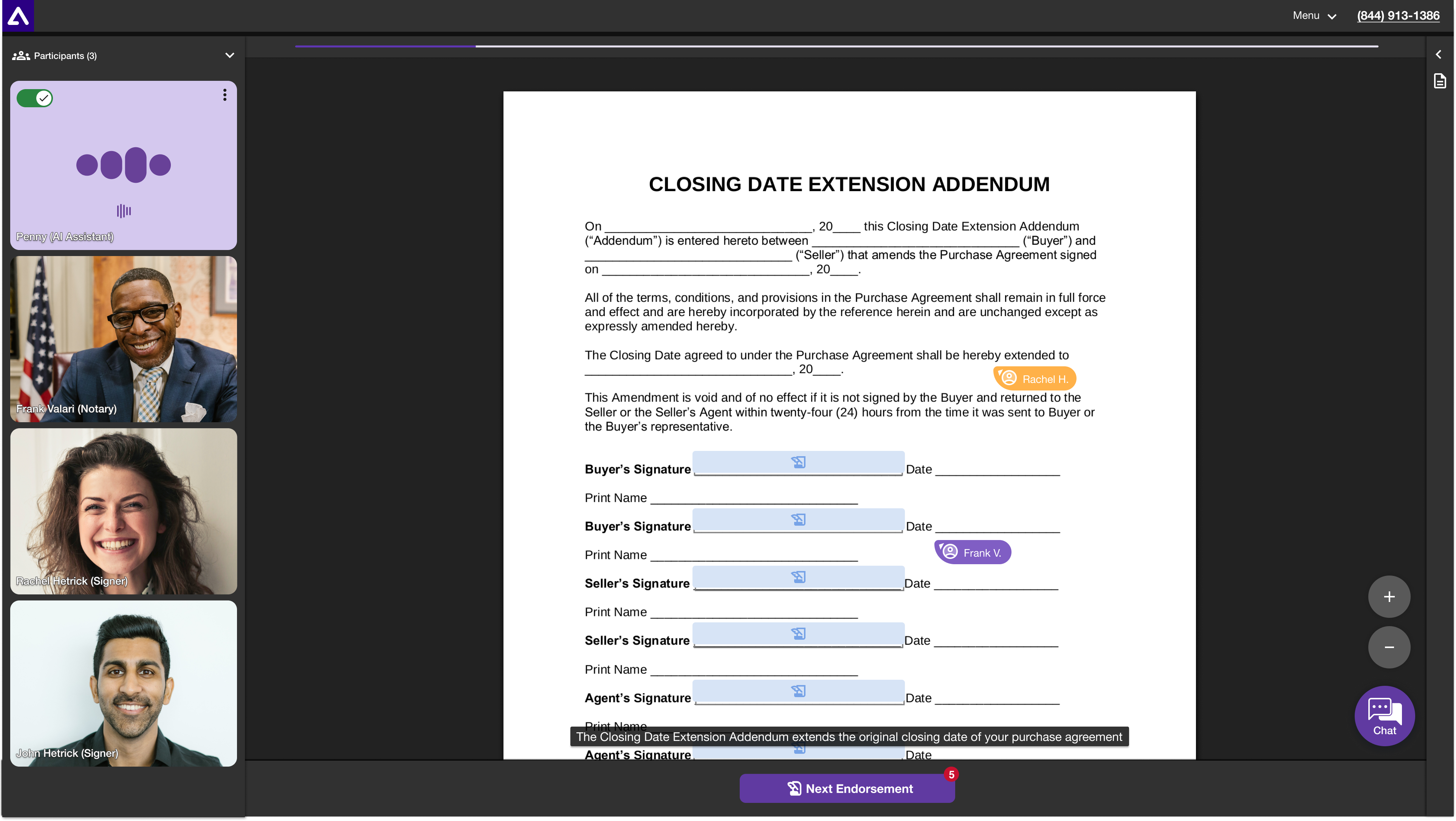
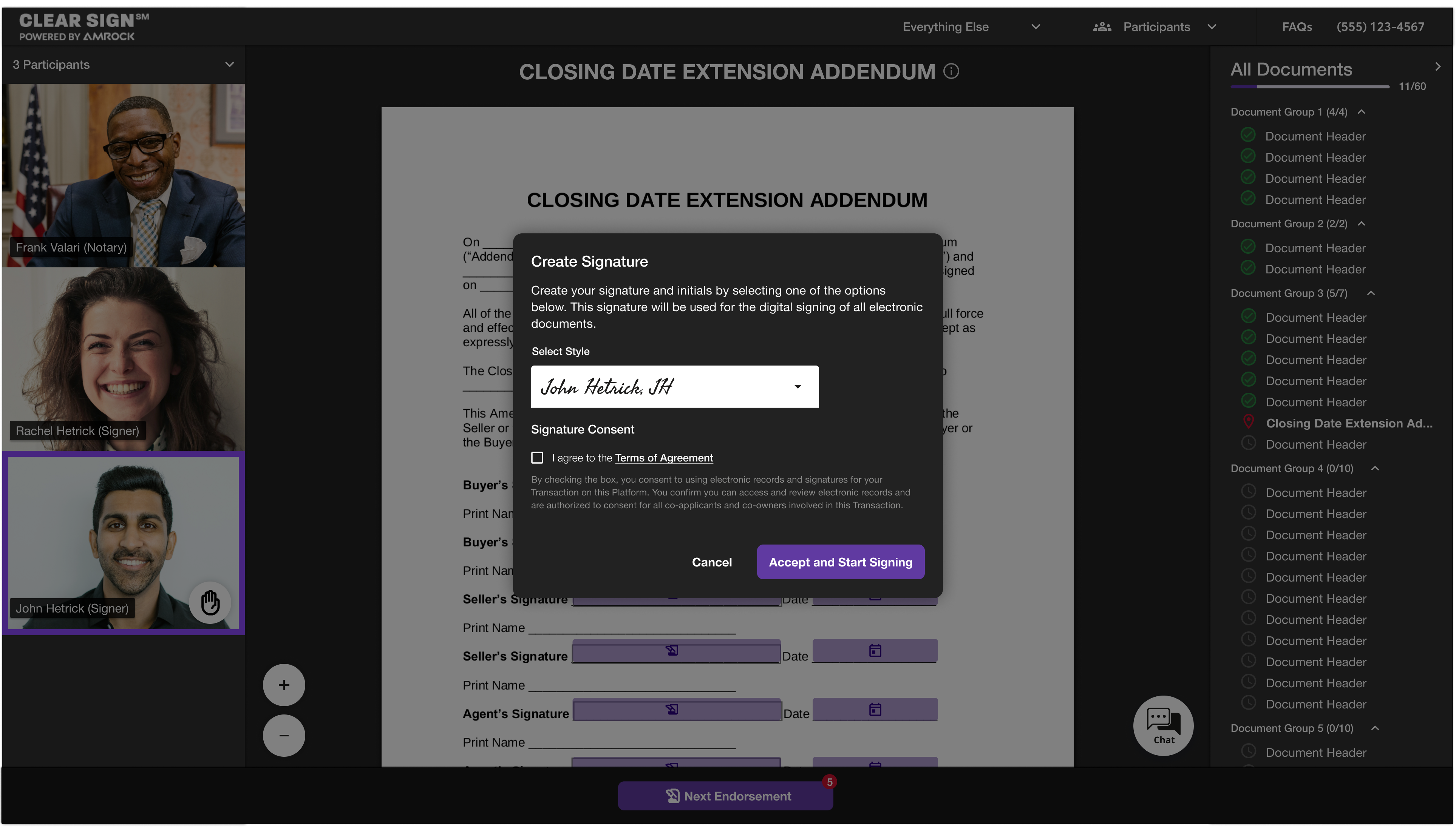
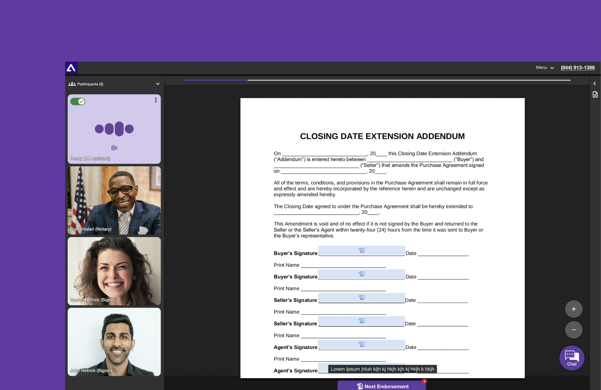
Pain Point: Difficult document navigation and abscence of dark mode caused discomfort and hindered collaboration during signing sessions. The lack of an intuitive document navigation system resulted in time-consuming processes, hindering the signing party and notary collaboration.
Solution: Redesigned the signing room to include a dark mode, decreasing eye strain and improving document navigation. This enhancement increased user comfort and facilitated efficient collaboration between the signing party and notary. Users now benefit from a more comfortable experience in low-light conditions and enhanced features, resulting in a more effortless remote online closing experience.
"What's Next" Page
"What's Next" Page
"What's Next" Page
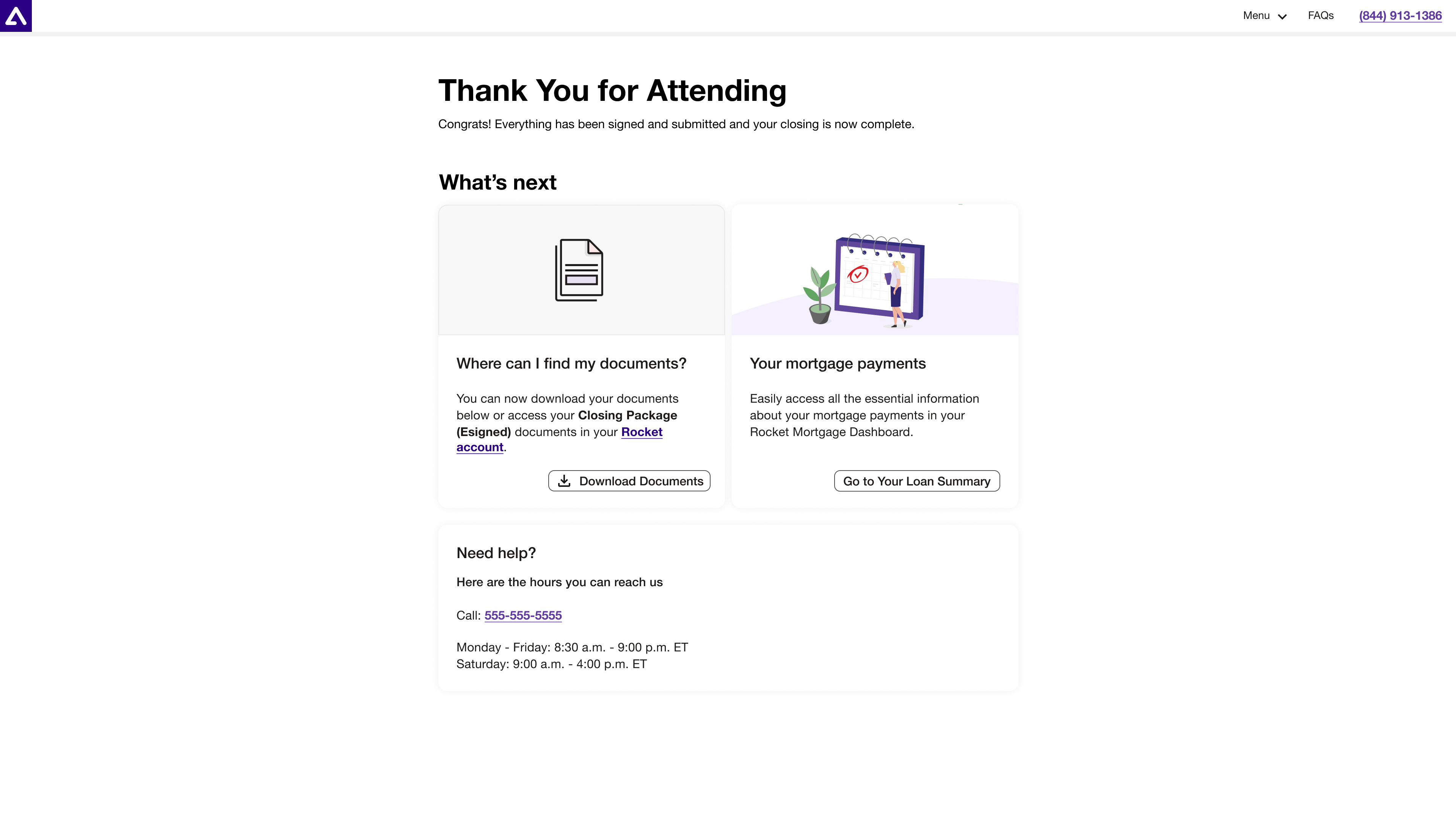
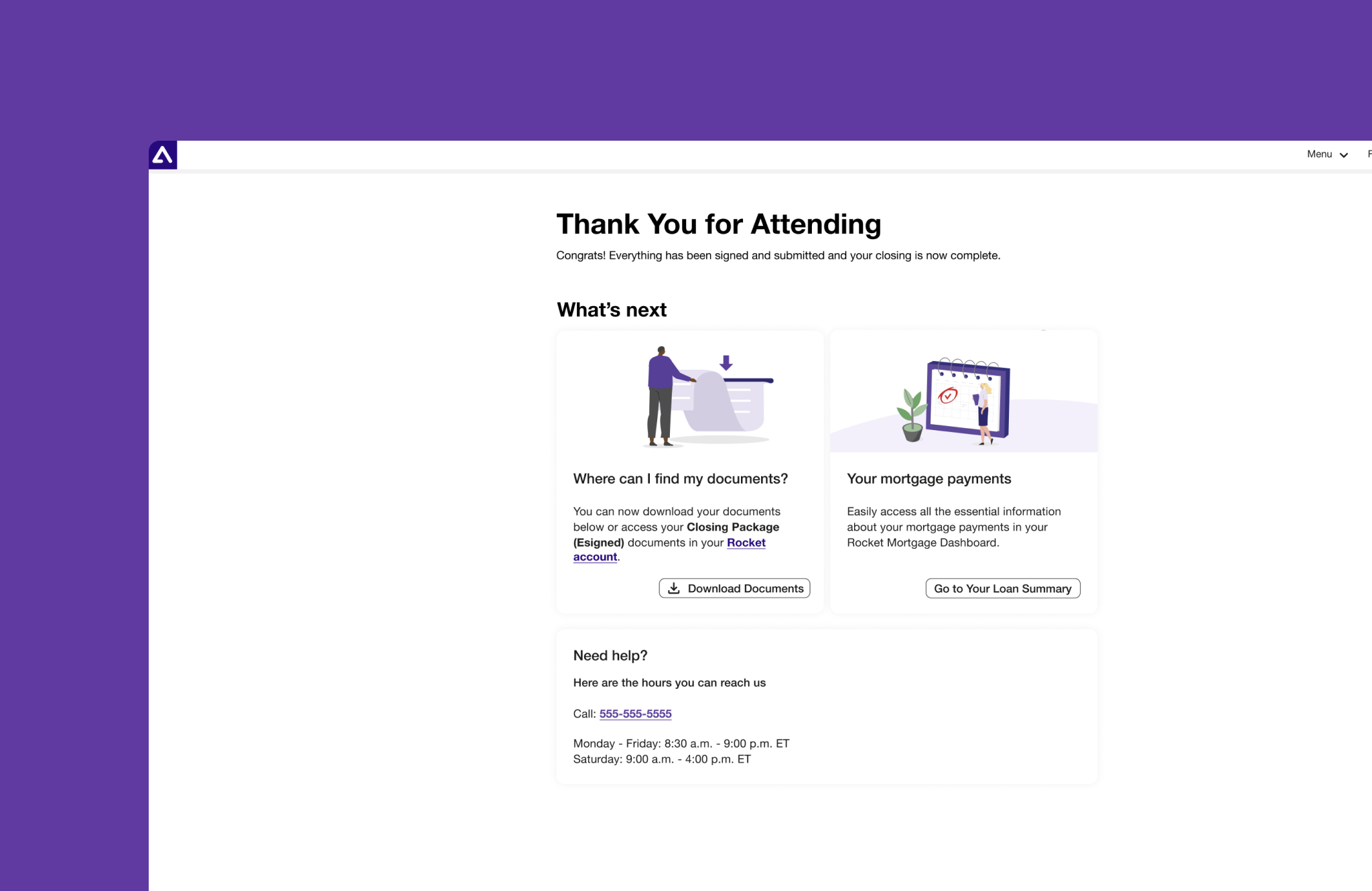
Pain Point: Users were unsure about the next steps after completing the signing process. The lack of clarity on the next steps leaves users confused and stressed leading to potential delays, inefficiencies and support calls.
Solution: Introduced a user-specific "What's Next" page providing clear, concise information on subsequent actions and where to find their documents, ensuring a more seamless and informed post-signing experience.

Process
Process
Process
Process
Process
1. Analyze requirements
2. Research best practices
3. Competitors analysis
4. User interviews
5. Wireframes, flows & prototypes
6. Define functionality
7. Define accessibility compliance
8. Usability testing
9. Iterations
1. Analyze requirements
2. Research best practices
3. Competitors analysis
4. User interviews
5. Wireframes, flows & prototypes
6. Define functionality
7. Define accessibility compliance
8. Usability testing
9. Iterations
1. Analyze requirements
2. Research best practices
3. Competitors analysis
4. User interviews
5. Wireframes, flows & prototypes
6. Define functionality
7. Define accessibility compliance
8. Usability testing
9. Iterations
1. Analyze requirements
2. Research best practices
3. Competitors analysis
4. User interviews
5. Wireframes, flows & prototypes
6. Define functionality
7. Define accessibility compliance
8. Usability testing
9. Iterations
1. Analyze requirements
2. Research best practices
3. Competitors analysis
4. User interviews
5. Wireframes, flows & prototypes
6. Define functionality
7. Define accessibility compliance
8. Usability testing
9. Iterations
Design and Research
Research
Research
Research and Discovery Phase:
In the research and discovery phase, I conducted user interviews with borrowers and notaries to understand their pain points and gather feedback on the existing app. I interviewed support agents and analyzed support call data to identify the most common issues faced by users and performed a competitive analysis to benchmark against other remote closing solutions in the market. This comprehensive research provided a clear direction for the redesign.
Design and Prototyping:
During the design and prototyping phase, I created wireframes and interactive prototypes for the new interface, focusing on a mobile-first design. Usability tests with target users were conducted to gather feedback and iterate on the designs. Throughout this phase, I collaborated closely with the development team to ensure that the designs were feasible and aligned with technical constraints.
User Testing and Feedback:
The user testing and feedback phase involved organizing multiple rounds of user testing to validate design decisions and refine the user experience. Feedback from these usability tests was incorporated to enhance clarity, accessibility, and overall usability. Regular review sessions with stakeholders and end-users ensured that the design met both business and user needs.

Key Challenges
Key Challenges
Key Challenges
Key Challenges
1. Wide target audience
2. Integration Complexity
3. User Acceptance
4. Security Concerns
5. Accessibility Compliance
6. Performance Optimization
7. Legal Compliance
8. Resource Constraints
9. Training and Onboarding
10. Merging RDS with Clear Sign
1. Wide target audience
2. Acquiring accessibility certification
3. Increasing simplicity and ease of use
4. Merging old and new functionality
5. Introducing new UI and components
6. Introducing new and interesting interactions
Solution Highlights
Solution Highlights
Solution Highlights
Throughout the redesign of Clear Sign, several significant challenges were encountered, each requiring thoughtful and innovative solutions to ensure a seamless and user-friendly experience. Here are the most impactful challenges and the solutions implemented:
Challenge: Ensuring a Seamless Experience for Multiple User Roles
Solution: Created tailored user flows for different roles (e.g., notaries, single borrowers, multiple borrowers), and tested extensively with real users to ensure a seamless experience for everyone.
Challenge: Wide Target Audience
Solution: Designed the interface to accommodate varying levels of computer literacy, demographics, languages, and ages. Implemented a user-centered design approach, incorporating feedback from diverse user groups to ensure inclusivity and accessibility.
Challenge: Legal Compliance
Solution: Worked closely with the legal team to ensure the application was compliant but also user friendly such as in the Terms and Conditions and Privacy Policy sections. Streamlined the legal copy and integrated it into the UX in a more user-friendly manner, ultimately improving clarity and reducing cognitive load.
Challenge: MISMO and Other Regulatory Constraints
Solution: Addressed MISMO compliance and other regulatory constraints, particularly around security questions for ID verification. Despite limitations (e.g., inability to show a timer or feedback on wrong answers), we developed a compliant solution that balanced security and usability. Continued efforts to improve the solution within regulatory boundaries.
Challenge: Integration Complexity
Solution: Managed the integration of various systems and technologies to ensure smooth operation and data flow. Collaborated with cross-functional teams to address technical challenges and streamline the integration process.

MVP's
MVP's
MVP's
1. Simplified Check-In
2. In-App Chat Feature
3. Improved Document Navigation
4. Mobile First Design
1. Wide target audience
2. Acquiring accessibility certification
3. Increasing simplicity and ease of use
4. Merging old and new functionality
5. Introducing new UI and components
6. Introducing new and interesting interactions
Results and Impact
Results and Impact
Results and Impact
The comprehensive redesign of Clear Sign successfully addressed user pain points, leading to a significant increase in user satisfaction, reduced support calls, and streamlined remote online closings. Users now enjoy a more accessible, secure, and delightful experience, solidifying Clear Sign's position as a modern, user-centric platform for home purchases under Rocket Companies. The success of this redesign underscores the value of user-centered design principles in reshaping digital experiences and simplifying complex processes for users.
The redesign of Clear Sign has yielded significant positive outcomes. User feedback indicated a 25% increase in overall user satisfaction, with many praising the mobile-first approach and enhanced accessibility features. Additionally, the application's user retention rate improved by 15%, signifying a higher level of engagement and desirability. The successful redesign has not only improved the platform's usability but also strengthened Rocket Companies' position as a leader in modernizing the home buying process.

Next Steps
Next Steps
Next Steps
AI & ML Enhancements
Enhanced Personalization
Additional Accessibility Features
Purchase flow adaptation
Learnings
Learnings
Learnings
The Clear Sign redesign was a rewarding project that underscored the power of user-centric design in transforming complex processes. By prioritizing mobile-first design, clarity, accessibility, ease of use, and desirability, we succeeded in creating an application that users love to engage with during the home closing process. As a UX designer, I take pride in my contributions to a platform that empowers users and facilitates seamless and secure remote online closings.
User-Centered Design: The importance of engaging with users and stakeholders early and often in the design process was paramount. This approach allowed us to identify pain points and iterate on solutions that truly met user needs, resulting in a seamless and intuitive user experience.
Balancing Compliance and Usability: Working closely with legal and compliance teams was crucial in creating solutions that adhered to regulatory requirements while still providing a user-friendly experience. This balance ensured that the application remained compliant without sacrificing usability.
Iterative Design Process: The iterative nature of the redesign demonstrated the value of continuously seeking feedback, iterating on designs, and refining features based on user input. This process was instrumental in ensuring the final product was polished and effective.
Prioritization: Navigating resource constraints and time limitations taught us the importance of prioritizing features and improvements based on their impact on the overall user experience. This focus allowed us to deliver the most value to users within the project’s constraints.
Security and Privacy Considerations: Addressing security concerns underscored the importance of robust measures to safeguard users' personal and financial information. This focus on security helped build trust and confidence in the platform.
Continuous Improvement: The redesign process highlighted the importance of continuous improvement and the need to gather ongoing feedback for future enhancements. This commitment to iteration ensures that the application will continue to evolve and meet user needs.
YEAR
2024
ROLE
Sr. UX Designer
CLIENT
Amrock & Rocket Mortgage
ABOUT CLIENT
Amrock is a subsidiary of Rocket Companies that manages the title services and closing of the mortgage process.
More Work
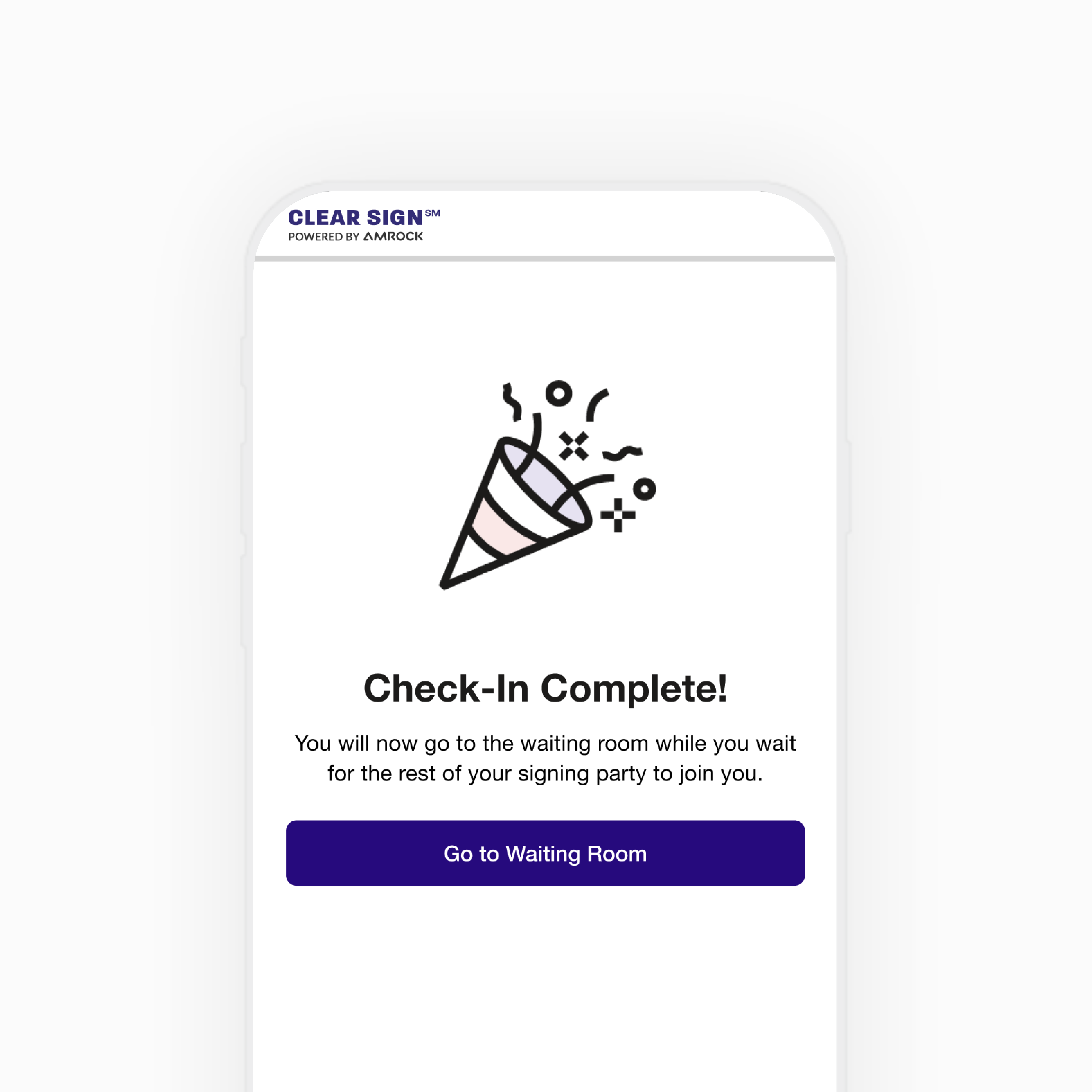
Clear SignUX | WEB APP
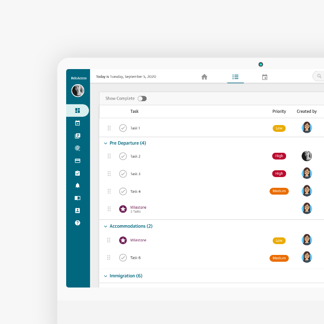
BGRS DashboardUX | DASHBOARD
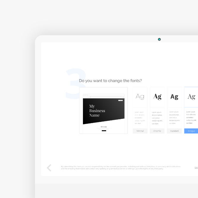
PromoPagesPromoPages Campaign
Vertical AdvisorUX | Product | Marketing

